digital printing

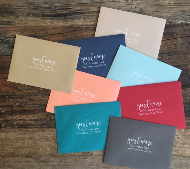
White Ink on Colored Envelopes, yea baby!

We are pretty sure you are going to love this option as long as you know how to set up your files for print. For now we are only printing addresses on the front of the envelope, stay tuned for addressing + back flap – we are working on it!

For variable data with white ink:

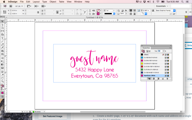
1.    Create a multi-page, 7.25″ x 5.25″ document with each name and address on a single page for the A7 envelope.

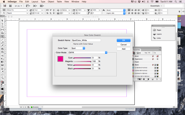
2. Create a new swatch called SpotColor_White. This example is in InDesign.

screen-shot-2017-02-28-at-9-11-06-am

3. All artwork, including each name and address should be assigned SpotColor_White.

screen-shot-2017-02-28-at-9-35-55-am

NOTE: WE DO NOT PRINT BLEEDS ON ENVELOPES, MAKE SURE YOUR ARTWORK IS AT LEAST .25″ FROM ALL EDGES

4. Save the file as a high resolution, multi page pdf file.

5. Upload the file.

6. Proof your artwork (you can view as many pages as you’d like).

7. Complete your order.

Order your White Ink Variable Data Envelopes today!

img_5359

The Craft Paper Look for Less

IMG_3873

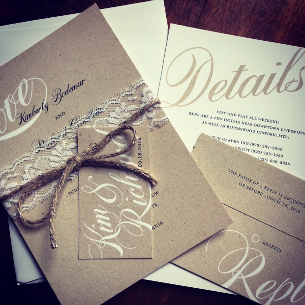
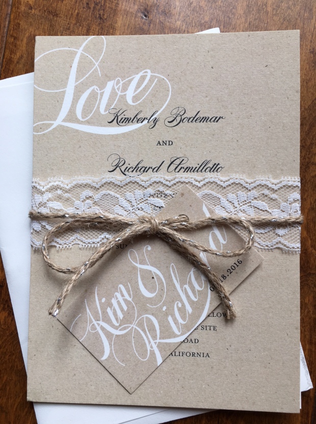
The bride loved the sweet look of craft paper for an outdoor winery wedding but only needed 60 invitations and really wanted to keep a tight budget for invitations. We used Natural Savoy Cotton for a nice textured finish, very similar to craft. Most of our flat cards come on Natural Savoy and the envelopes are a perfect match. To create the small hang tags, I used a 4Bar card and set up the files with two cards that I could cut down after printing 30 originals. Tags_Front

I ran a DIY test print with various craft paper photos to make sure that the color was right and it really looked like craft (to non-designers who wouldn’t inspect the edge of the card to see if it was legit).

This solution is not for the purist, but it’s perfect for a quick turnaround, very affordable white-ink-on-craft-paper-look wedding suite.

IMG_3871

Beef up the bottom line with flat cards for the holidays

toolsMost of us creative types are all about the design, the message and the media. We aren’t crazy about the math, it’s usually not in a Top 10 priorities spot when we are brainstorming. Here’s the thing though, understanding the bottom line is kind of, you know, crucial. Flat cards from StationeryHQ are a great way to be well-compensated for your talent and efforts.

If you are a wholesale customer, a two-sided, full color, flat A7 card will start at  $.43 each. So for the sake of argument, let’s say you order 50 for a total cost of $21.50 + shipping. Flat cards on fine papers sell on major retail sites for OVER $2.00 each. That’s $100 for a set of 50, leaving you with $79.50 per order. Do 10 orders like that per week (pretty easy workload, right?) and you’re making about $3,000 a month without breaking a sweat. If you did the same number of cards/orders with folded cards, your margin would be closer to $2,000 per month and you had to work a little harder to set up the artwork. See how fun the math is now?

A few more $ tips:

• Requiring a minimum of 25 or 50 as opposed to 10 gets you more profit with exactly the same amount of work.

• Charge a premium for extras like rounded corners, still no extra work for you but a sassier product and better margin.

• Offer incentives for large orders, many customers will “order up” when they know they are close to a discount or promotion.

• Encourage your clients to order early to save on shipping costs. And so you can enjoy the holidays.

Cheers!

Foil continues to shine

You designers have made foil for online automated ordering one of our fastest growing categories. The rest of the world is still falling in love with this look so be sure to include in your 2015 holiday collection. Keep in mind that it takes 7 – 10 business days as opposed to 3 days to produce. Order early so you don’t have to stress about getting them out on time.

foildots

Silver foil on Natural Savoy. Boom.

Things to know when you are designing for foil:

– Foil reproduces best on smoother papers, if you want to use cotton or felt, keep it big and bold

– Make strokes 2pt or bigger

– Simpler, solid artwork will reproduce the foil best

– Comes in A7, A2 and 4bar

– File set up is a little different, check out file set up instructions, you’ll find them under the white card preview

Silver foil on Ice Pearl. Mmmm, so shiny.

Silver foil on Ice Pearl. Mmmm, so shiny.

Available foil colors.

Available foil colors.

Get your shine on and post your foil design pics on our facebook page so we can celebrate your sparkle

Guest Post from a Kick Ass Designer

Hello, I’m Melinda Hartz McElroy, founder and creative director of billet-doux. I’ve been dreaming up couture stationery, invitations and wedding suites since 2005. I love telling personal stories through something tangible, tactile and visually stimulating. But, as I was realizing visions for couture clients, I started to wonder, “How do you stay relevant in the broader marketplace?”

So, I decided to do something completely radical – launch my first ready-to-order wedding collection. What a novel idea! Having previously only collaborated with clients on a custom project basis, I threw caution to the wind and designed suites for imaginary brides and grooms. I immersed myself in fresh and current wedding trends and created a comprehensive collection across a variety of style categories.

It’s easy to get caught up in each and every delightful trend happening in our industry right now, but I kept focused with my targeted list of on-trend must-haves. Mixed typography, handwritten fonts, hombre color effect, monograms, polka dots, lace, floral patterns, and rustic and rhinestone details are among them. But, what are my top obsessions these days? [queue music]

brooklyn detail_website

1) All Things Whimsy

Whimsical elements will forever be at the tippy top of my list. At the core of who I am as a person and a designer, I love the element of surprise and the unexpected. The Brooklyn suite is a sharp detour from my typical design aesthetic; yet, it’s ironically my favorite of the collection. Brooklyn is modern yet whimsical, and perfect for the bride throwing an untraditional, offbeat wedding. [I heart that girl!]
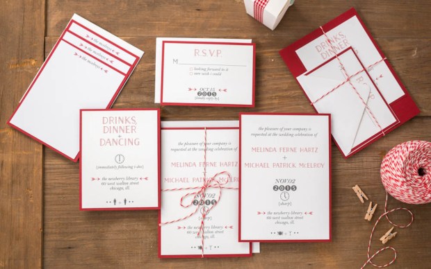
Brooklyn Wedding Suite – billet-doux Spring 2015 Bridal Collection  Printed by StationeryHQ

Brooklyn Wedding Suite – billet-doux Spring 2015 Bridal Collection
Printed by StationeryHQ 

2) Glam/Art Deco/Metallic

So, I squeezed three trends in one, but let’s face it – they all go together like peanut butter and jelly. Dare to kick up the glam by adding to something that’s already glamorous in its own right (that’s you, gorgeous bracket die-cut pocket enclosure!)? Selecting a rich metallic color palette and pairing it with mixed typography (another design mainstay) in simple colors creates an added layer of formality. But it’s the gorgeous glam rhinestone embellishment that transports guests of this Gatsby suite back to the Art Deco era.

gatsby details_website

Gatsby Wedding Suite – billet-doux Spring 2015 Bridal Collection Printed by StationeryHQ

gatsby collection_website

3) Dreamy Paper

I find leveraging beautiful paper to be an uber refreshing design tactic. I mean, why reinvent the wheel with every card? Let thoughtful typography or custom monograms punctuate a suite, and rely on fine papers and gorgeous prints to take the lead in setting the tone. Together or on its own, printing on dreamy double thick paper can easily add a lot of impact and take your design to a whole other level. (Thank you, StationeryHQ!)
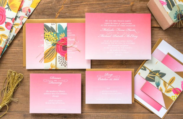
Petal Wedding Suite – billet-doux Spring 2015 Bridal Collection Printed by StationeryHQ

Juliet Wedding Suite – billet-doux Spring 2015 Bridal Collection Printed by StationeryHQ on double thick card stock; Rifle Paper Co. floral bellyband
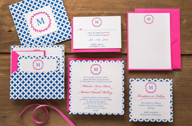
petal collection_website

Petal Wedding Suite – billet-doux Spring 2015 Bridal Collection Printed by StationeryHQ

Enjoy my portfolio and billet-doux’s complete 2015 Spring collection at www.couturestationery.com. Keep in touch on Facebook at www.facebook.com/billetdouxinvitations or at [email protected]

melinda headhsotAbout Melinda McElroy

Melinda Hartz McElroy is founder and creative director of billet-doux. From fêtes to gratitude, billet-doux has been spicing up mailboxes with one-of-a-kind cards since 2005. Melinda is the former National Marketing Director of a multinational billion-dollar accounting and consulting firm. Melinda oversaw marketing and advertising campaigns for 42 offices across the United States.

By pairing clients’ individual style with billet-doux’s unique brand of creativity, Melinda dreams up pieces that even make wallflowers bloom. Whether creating something couture from scratch or selecting from readymade collections, all items are fully customizable without limitations. billet-doux’s service offerings include wedding suites, social and business stationery, party and corporate event invitations, event details, baby announcements and holiday cards.
GIFT TAGS – WOOHOO!

SHQ_GiftTags

You’ve been asking for these little goodies for awhile now and I’m so happy we are able to deliver! If they are as big of a hit on StationeryHQ.com as we hope, we’ll add more sizes and shapes after the holidays. Go here for pricing, don’t forget to register/login for wholesale pricing: Gift Tags

In the meantime, here is a graphic to help you set up your files.

Die_2.5GiftTag

Die_2.5GiftTagBack

Color: WTH?

What The Hue? Designers love color. We love love love it. And it makes us want to pull our hair out when we can’t get the color we see on our monitor to match the color we see on paper. There are many variables that affect color: our monitor settings (which will never match our clients settings), the tone of the paper we print on (not all white papers are created equal) and color blindness (for real, 8% of men and .5% of women are color blind). 

Color test on different papers.

Color test on different papers.

Here are some tips to help you get the best results and make peace with what you can’t control.

Let’s start with what you see on your screen. 

– Apple monitors tend to be lighter overall than PC monitors. So if you’re on a Mac and sending digital proofs to someone on a PC, they are likely seeing a darker version. Your only tool for dealing with this is knowledge. Optimize your monitor settings and talk your client through it if they say “it looks dark.”

– RGB will ALWAYS look more intense and pure than printed CMYK. It has to do with RGB colors coming from light and CMYK colors coming from surface material. Here’s a good article for color geeks.

Here’s what we know about color in print:

– Paper can be considered a color. If you choose a natural or ivory stock, you are adding up to 10% yellow to your color mix. For the truest color, pick the brightest white stock. Our brightest whites are the #110 uncoated (it has a cool tone), Savoy (warm tone) and Felt (warm tone).

same CMYK values printed on Savoy White and Savoy Natural

Same CMYK values printed on Savoy White and Savoy Natural

– Uncoated papers will soak up more ink than coated or gloss stocks, giving them a less vibrant appearance. So if you want really bright color on uncoated paper, you gotta saturate it – give it more ink than you think you need.

– CMYK digital printing is not perfect. You won’t get the same result on different days like you might if you used Pantone colors (which are the equivalent of a can of paint). There are only about a million variables that affect digital printing.

For the best results, I have printed my own color swatches (which I update by trend or season) on multiple stocks so I have a good idea of the difference between my screen and my print jobs. I use the DIY product option on StationeryHQ.com so I can fit lots of decent sized color swatches.

My color swatches rank right up there with pictures of my kids in my studio.

My color swatches rank right up there with pictures of my kids in my studio.

If you are designing a stationery suite, try using complementary colors or adding texture into your system to break it up. Matchy-matchy is getting kind of old school and then you won’t be so stressed when your coral invite looks 1% lighter than your coral RSVP card. 

Please post your questions, suggestions or photos of great solutions on our facebook wall, we all appreciate the extra help.

Who wants to create variable data envelopes with cool fonts through illustrator?

Designers have their favorite tools. Some of us old people remember the Pagemaker versus Quark wars which was like debating about Democrats and Republicans. No one is changing their mind.

The one platform that rarely is debated is the illustration tool. Adobe Illustrator won without any serious competitors. It is an amazing tool for design and we love it from a production standpoint. Vector art produces the best output but when it comes to variable data we recommend InDesign.

If you’re an Illustrator purist, there are options for you. Click the link below to learn how to set up variable data in Illustrator, it’s definitely for the advanced user.

Have fun reading (yeah, it’s a bit dry) and hurry up and create some awesome looking variable data envelopes we can produce for you and make your customers smile.

Let Your Design Shine

Need a little “glam” for your next piece? In case you didn’t already know, we offer foil stamping in an assortment of colors to add that special shine. Here are a few words from Red Pearl Designs:

The foil printing turned out beautiful! I was extremely impressed with the quality and fast service I received from StationeryHQ. Thank you for the great work!

RedPearlDesigns_image_201312-300x207

So, what are you waiting for? Let your design shine now.

An iPhone’s New Use for Print

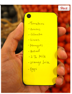
Screen-Shot-2013-10-04-at-8.38.55-AM2-232x300I bet you thought all those wonderful iPhone apps like StorytreeMosaic, and the like are great examples of moving digital images to tactile printed books. Well, you’re right.

But did you know that the iPhone can also double as a hard writing surface for taking notes? That’s right folks – with a $400 price tag, this amazing tool can actually assist you in both digital and analog applications. Why do you need an analog solution for writing notes when you have a digital one in the palm of your hand? I don’t know. What I do know is there’s just something great about paper and pencil, or paper and ink. I can’t explain it. Taking digital notes is not hard, but I much prefer to write them down. What’s that? I’m old? True, but why are so many millenials buying and using products like these?

There as so many digital apps which are now exploring how to bring the results to their customers in some type of printed form. Last year, our parent company, Progressive Solutions, started manufacturing photo books for other companies. We currently have no less than ten different customers and prospects trying to launch some type of printed solution for their online store or application. We can’t build these integrations fast enough to keep up with the demand.

I believe it was first said by Indigo inventor Benny Landa, “Everything that can become digital will become digital – and printing is no exception.” I believe Benny is absolutely correct. I’d just like to make a slight revision to this famous quote, “Everything that can become digital will become digital – and then a boatload of it will become analog again.”

Keep on bringing beautiful designs. There will always be a place for them on a tactile substrate, and people will always love and appreciate what you do.

What’s your take? Is print going away or here to stay?