Month: May 2015

WTH is navy blue and why does it look purple?

What you see on screen can vary from the final printed product and this is often true when working with the color navy blue. It looks like the perfect blue on your monitor, but when you get your cards back, first you see purple and then you see red! Your monitor uses the RGB color model (red/blue/green) which differs from the CMYK (cyan/magenta/yellow/black) ink colors used in print, making navy a thorn in your side.

navy2a

The issue is caused by the amounts of cyan and magenta in the mix. Remember learning about the color wheel in school? You learned that when you mix blue with red, you get purple, right? It’s the same idea with 4 colors, too. Too much magenta mixed with cyan will leave you with purple, when you really wanted a dark blue. The color might look right on screen, but it will most likely print more purple than blue. Paper can also affect the way a color prints, but that’s a whole different story.

navy2b

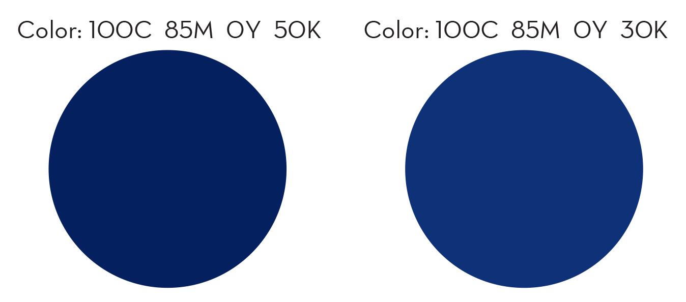
A good mix for navy blue can vary a bit. 100C/85M/0Y/50K will give you a darker navy blue. You can always adjust the black (K) if it seems too dark. 100C/85M/0Y/30K will produce a lighter navy and even though it looks deceptively close to 100C/95M/0Y/0K on screen, don’t let your eyes fool you. Of course, there’s no absolute perfect mix, but these are good bets. Give one of them a shot next time you’re prepping files to upload to StationeryHQ!

The magical world of flat foil

11x14Since launching Flat Foil Art Prints last week, we keep hearing the same question, “How does it work?”

When SHQ Customer Success Representative Chris was asked this question yesterday, he replied, “It’s magic!” He’s right. It’s so easy, it practically is magic.

Here’s what you do:
1. Create your design using one color only. Your swatch needs to be 40C/40M/20Y/100K.
2. Save as PDF/X-1a, per the StationeryHQ File Setup Guidelines.
3. Upload your file and wait for the magic to happen.

Here’s how it works:
The rich black ink is printed on paper, then the printed sheet is run through a foil machine. The foil adheres to the ink and viola, flat foil fabulousness! You get the same shine as traditional foil stamping but not the slight depression you can feel on a foil stamped card.

And the best part? No die is required. That means faster production time and lower cost. And you can upload your files the same way you do for our other non-custom products.

The small type on this card is 7pt. ITC Lubalin Graph - looks great in foil

The small type on this 5″ x 7″ card is 7pt. ITC Lubalin Graph – looks great in foil

Large solids actually work really well and small type works too. I tested a .75 pt. stroke and the foil came out beautifully.

We’re calling them art prints but since they come in sets of 10, I’m using them as flat cards and 8″ x 10″ notebook covers. Yes, my friends are the types who prefer a bit of snark and a well-designed cuss word in their birthday/thank you cards 🙂

Foil makes a sassy notebook at a great price.

Foil makes a sassy notebook at a great price.


We are testing options for foil combined with digital color. We already know that it can be done but so far the results are inconsistent. Stay tuned for more options if flat foil sells as well as we are predicting!

I feel the need – the need for a bleed

You’ve designed a fabulous card and now you want StationeryHQ to print it! You saved a PDF/X-1a, just like the SHQ File Setup Guidelines say, but your file doesn’t fit the preview area. What happened? It could be that you didn’t account for bleed in the file.

Bleed is essential in print so the image goes all the way to the edge of the card. Without bleed, you’ll get white strips around the design that aren’t meant to be there. Even if your card has a white background, it can still be cut the wrong size if a bleed is not included.

There are two ways to add bleed to your file. This example uses Adobe Illustrator, but this process is universal with Adobe software.

Method 1: Add bleed to file by calling out a “Bleed”

The screen shot below shows how to set up your file from scratch using this method. When creating a new document, plug in the size of the final card size (we used 5 x 7) and then call out the bleed below. SHQ requires a .25 bleed to both width and height, so you’d add .125 on all four sides for a total of .25 to both dimensions.

bleed1


The screen shot below shows how the file you just created should look. The artboard is 5 x 7 and has a .125 bleed all the way around. Your design should go all the way to the red line around the 5 x 7 to cover the bleed area.

bleed1a

Then when you go to save your fab design, make sure to check the box “Use Document Bleed Settings” in the pop-up window.

bleed1b


Method 2: Add bleed to file by including bleed in the size of your artboard

The screen shot below shows how to set up your file from scratch using this method. When creating a new document, plug in the size of the final card size including .25 for bleed. We made a 5 x 7 card, so the dimensions would be 5.25 x 7.25. Leave the Bleed section alone because the bleed will be added in to the size of your art board.

bleed2

The screen shot below shows how the file you just created should look. The art board is 5.25 x 7.25. Your design should go all the way to the edge of the art board to cover the bleed area.

bleed2a

Then when you go to save your fab design, do not check the box “Use Document Bleed Settings” in the pop-up window. You’ve already added the bleed to your final size, so you’re good to go.

bleed2b


And for good measure, don’t forget to outline fonts, change all Pantone colors to CMYK and save as a PDF/X-1a.

Now when you upload your 5 x 7 card to the website, it should fit perfectly into the preview!