navy

White Ink on Colored Envelopes, yea baby!

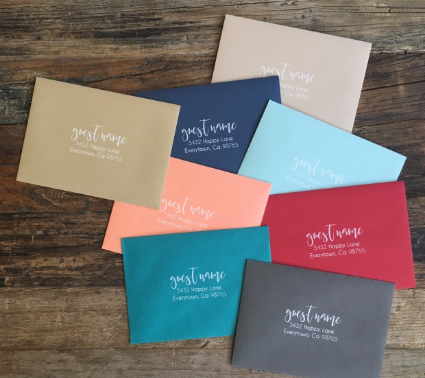
We are pretty sure you are going to love this option as long as you know how to set up your files for print. For now we are only printing addresses on the front of the envelope, stay tuned for addressing + back flap – we are working on it!

For variable data with white ink:

1.    Create a multi-page, 7.25″ x 5.25″ document with each name and address on a single page for the A7 envelope.

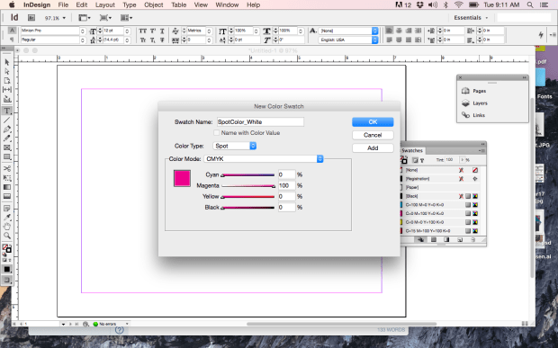
2. Create a new swatch called SpotColor_White. This example is in InDesign.

screen-shot-2017-02-28-at-9-11-06-am

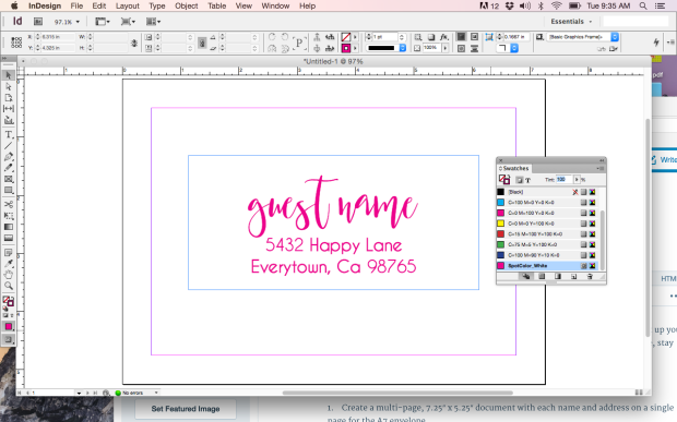
3. All artwork, including each name and address should be assigned SpotColor_White.

screen-shot-2017-02-28-at-9-35-55-am

NOTE: WE DO NOT PRINT BLEEDS ON ENVELOPES, MAKE SURE YOUR ARTWORK IS AT LEAST .25″ FROM ALL EDGES

4. Save the file as a high resolution, multi page pdf file.

5. Upload the file.

6. Proof your artwork (you can view as many pages as you’d like).

7. Complete your order.

Order your White Ink Variable Data Envelopes today!

img_5359

WTH is navy blue and why does it look purple?

What you see on screen can vary from the final printed product and this is often true when working with the color navy blue. It looks like the perfect blue on your monitor, but when you get your cards back, first you see purple and then you see red! Your monitor uses the RGB color model (red/blue/green) which differs from the CMYK (cyan/magenta/yellow/black) ink colors used in print, making navy a thorn in your side.

navy2a

The issue is caused by the amounts of cyan and magenta in the mix. Remember learning about the color wheel in school? You learned that when you mix blue with red, you get purple, right? It’s the same idea with 4 colors, too. Too much magenta mixed with cyan will leave you with purple, when you really wanted a dark blue. The color might look right on screen, but it will most likely print more purple than blue. Paper can also affect the way a color prints, but that’s a whole different story.

navy2b

A good mix for navy blue can vary a bit. 100C/85M/0Y/50K will give you a darker navy blue. You can always adjust the black (K) if it seems too dark. 100C/85M/0Y/30K will produce a lighter navy and even though it looks deceptively close to 100C/95M/0Y/0K on screen, don’t let your eyes fool you. Of course, there’s no absolute perfect mix, but these are good bets. Give one of them a shot next time you’re prepping files to upload to StationeryHQ!