design

In a Designer’s Head: Cutting Through the White Noise to Get to the White Space

I’m pretty certain that I speak for many of us in the creative profession when I say that we have A LOT going on inside our heads. We are the rare breed who engage our right and left brains concurrently, which means we are dreaming up things that have never been seen at the same we are creating a a perfect grid with which to align every single element on a page. We are constantly distracted by unexpected colors and textures at the same time we are noticing a pattern of lines in a busy intersection. We’re wishing the menu had better typography while we’re debating whether we need more protein or more dark leafy greens for lunch.

I will never have enough notebooks/sketchbooks to record all of my big ideas. These are just the books I can see without getting up from my desk.

To be honest, it’s exhausting. That’s why all designers worth their salt are totally addicted to coffee. Like if the Zombie Apocalypse happens and we have to quickly gather survival supplies, it goes 1. COFFEE 2. Everything Else.

But I digress. The upside of all of this activity in our noggins is that we are energized by it just as much as we are exhausted by it. We fall into the “Easily Amused” category because we are surprised and delighted by creativity, in all its glorious forms. It makes life more fun. It means we can often find the upside or the solution when it appears that there are only obstacles.

I have to manage the funhouse that is my head. When it’s time to say, write a blog post without going off topic, I very deliberately set the stage. It looks like this:

  • Write “Blog Post” at the top of my left aligned list
  • Take care of any easy To Dos (answer the quick email, unload the dishwasher)
  • Reheat my coffee (for the 3rd time)
  • Turn the ringer off
  • Close extraneous windows on my computer

After all that, there’s like a 70% chance that I won’t get distracted. I started this post yesterday, btw. But I had to take a break to play with the dog. And then I got thirsty. And then I saw a funny tweet and couldn’t stop laughing and forgot all about this post.

I don’t think the rest of the world understands how special a person has to be to have this much going on in their head and still figure out what the client really wants, be original, communicate clearly, meet every deadline, run a business and be a decent human. I’m not saying we’re unicorns. But have you ever seen a designer and a Unicorn in the room at the same time? Ok, I’m totally saying we’re unicorns.


Blush and Gold Wedding Papers

IMG_0216

Waste Not Luxe Blush Envelope lined with engagement photo

We were lucky enough to have two of our kids get married in the last year and a half and this time the bride had a vision of a romantic blush wedding with a dash of sparkle and a ton of fun.

This slideshow requires JavaScript.

The invitation was double thick with matte gold foil. This is a custom order since I included two different processes. Because I am high maintenance.

I used our Art Print option for the signs. The easel sign is 18 x 24 mounted on foamcore. The Guest Book and Unplugged Ceremony signs are 11 x 14 to fit in standard frames.

The wedding day was hot as Hades and we didn’t want our guests’ flyness to melt so we did last minute misters (with lavender, cuz we are cool like that) and since I’m a designer I really needed the little bottles to look cute and not… last minute. So I printed 3″ round labels (because rectangles are way harder to line up on 180 bottles) and we made fans out of  Flat A9 Cards.

IMG_6060

There was no printing involved in this photo, but isn’t my son so handsome? The bride is pretty cute too.

Our flat foil variable data place cards were perfect for this look. We included a menu which was silly because the guests didn’t have a choice. I created 10 original menus (and printed 20 of each) that included a joke and fortune in case the peeps at the table needed an icebreaker. #10 Flat Cards with rounded corners were perfect to insert in the blush linens. This was a huge hit with our guests.

IMG_3647

That’s me and Mr. StationeryHQ smooching on the right. Wish I could do my own wedding all over again, good thing I have one more kid to go… see more of our guest book options and wedding supplies here.


White Ink on Colored Envelopes, yea baby!

We are pretty sure you are going to love this option as long as you know how to set up your files for print. For now we are only printing addresses on the front of the envelope, stay tuned for addressing + back flap – we are working on it!

For variable data with white ink:

1.    Create a multi-page, 7.25″ x 5.25″ document with each name and address on a single page for the A7 envelope.

2. Create a new swatch called SpotColor_White. This example is in InDesign.

screen-shot-2017-02-28-at-9-11-06-am

3. All artwork, including each name and address should be assigned SpotColor_White.

screen-shot-2017-02-28-at-9-35-55-am

NOTE: WE DO NOT PRINT BLEEDS ON ENVELOPES, MAKE SURE YOUR ARTWORK IS AT LEAST .25″ FROM ALL EDGES

4. Save the file as a high resolution, multi page pdf file.

5. Upload the file.

6. Proof your artwork (you can view as many pages as you’d like).

7. Complete your order.

Order your White Ink Variable Data Envelopes today!

img_5359

The Craft Paper Look for Less

IMG_3873

The bride loved the sweet look of craft paper for an outdoor winery wedding but only needed 60 invitations and really wanted to keep a tight budget for invitations. We used Natural Savoy Cotton for a nice textured finish, very similar to craft. Most of our flat cards come on Natural Savoy and the envelopes are a perfect match. To create the small hang tags, I used a 4Bar card and set up the files with two cards that I could cut down after printing 30 originals. Tags_Front

I ran a DIY test print with various craft paper photos to make sure that the color was right and it really looked like craft (to non-designers who wouldn’t inspect the edge of the card to see if it was legit).

This solution is not for the purist, but it’s perfect for a quick turnaround, very affordable white-ink-on-craft-paper-look wedding suite.

IMG_3871

Do you need custom sizes in small quantities? We got you.

We know how designers like to create original everything so now we have an option for that. If you want a non-standard size in a flat, one-sided format in small quantities, our new DIY Sheet with Cutting is for you. DIY

Here’s how to set up files in Illustrator:

  1. Create a 12″ x 18″ document, either landscape or vertical.
  2. Add guides for the print area: 11.5″ x 17″
  3. Create artwork in desired sizes and fit into print area, place all pieces at 90 degree angles, we cannot cut odd angles.
  4. Make a square or rectangle in the size you want, select it, then go to Objects > Create Trim Marks.
  5. If you have color or images that bleed off the edge, expand them to go at least .125″ beyond the trim marks.

Tip: Leave at least a 3/4″ between pieces for best results.

Minimum: 25 sheets, $1.77 per sheet (if you have a wholesale account)DIY_after

DIY Sheets with Cutting is a great option for a set of odd sized cards, wedding place cards, custom sized postcards, disposable coasters and whatever else you creative types can come up with.

Foil Stamped Stationery: Can’t get enough shine.

RoseGold
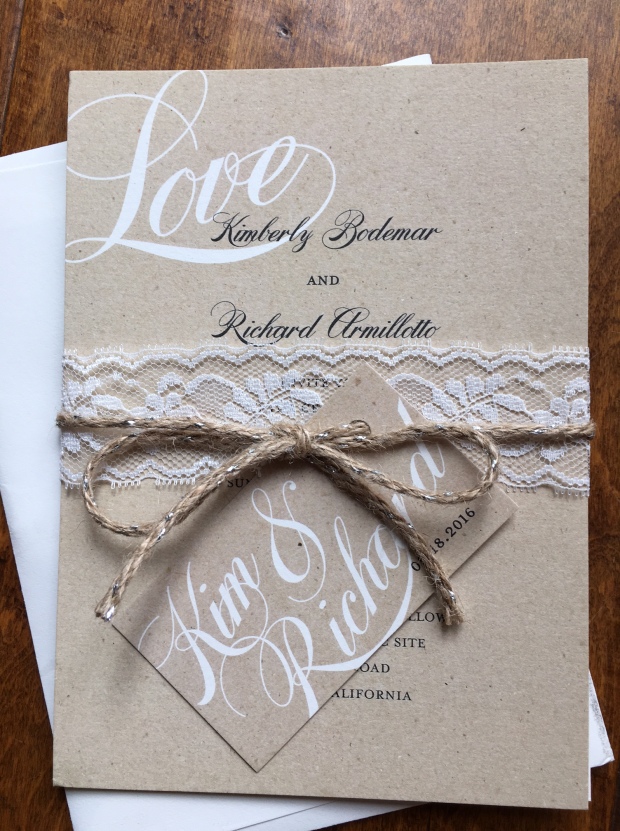
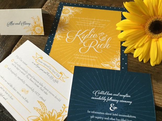
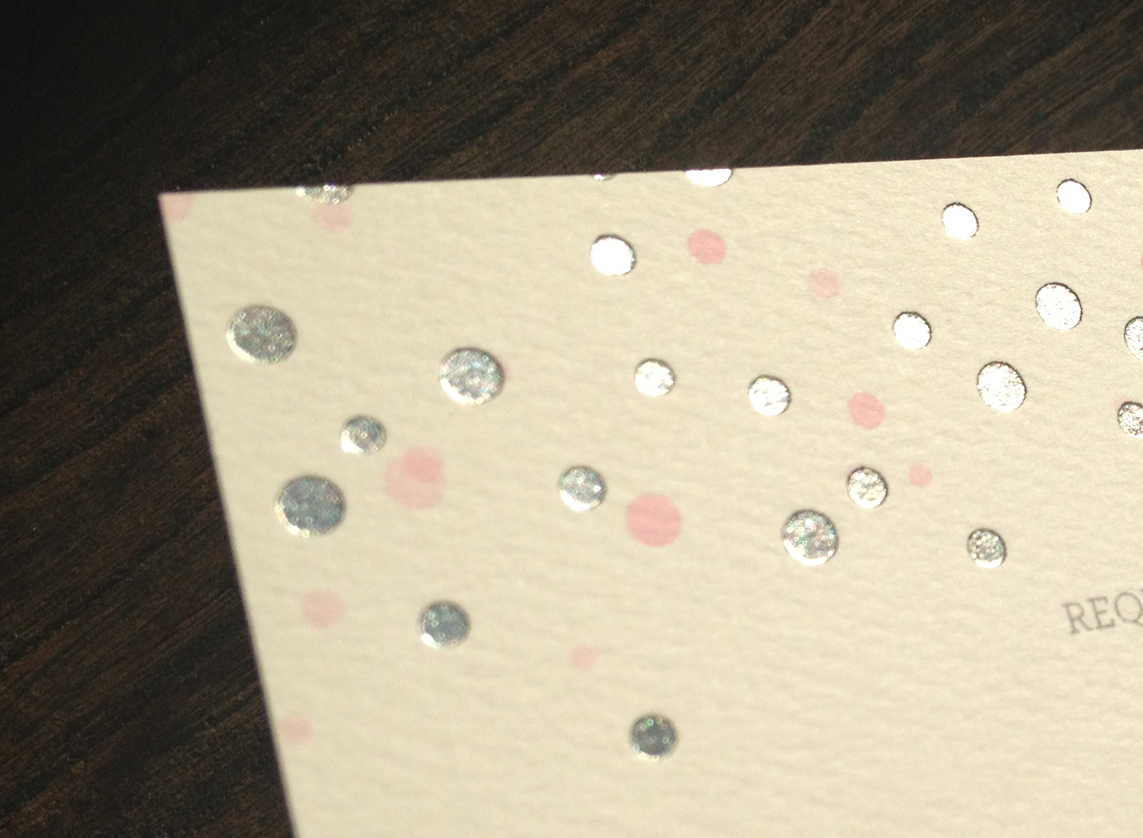
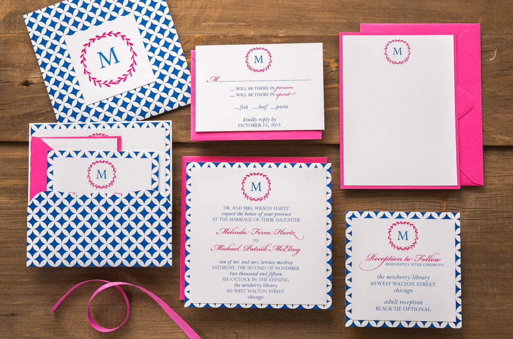
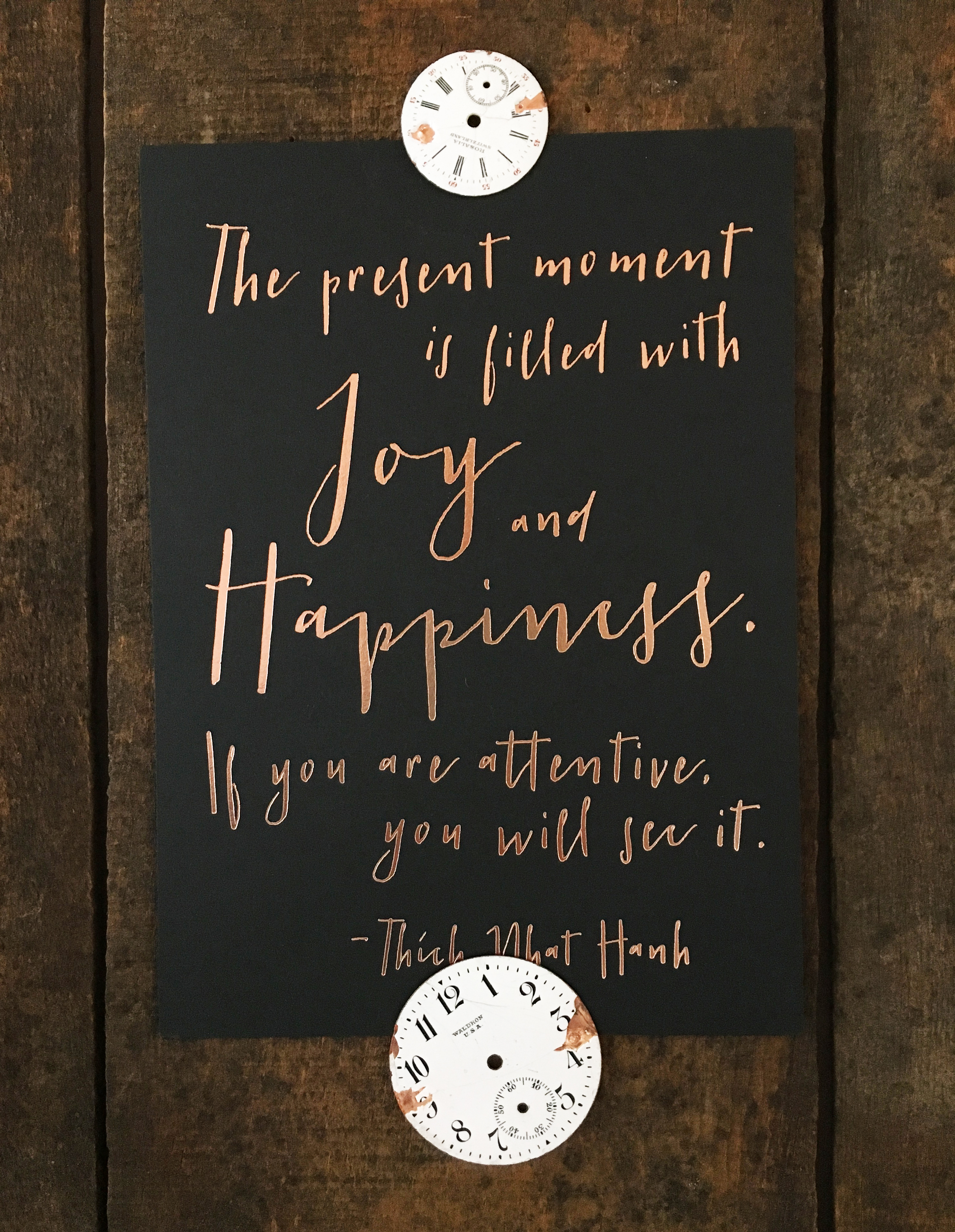
Yep, we added more foil stamping color options on StationeryHQ.com because we know you’re obsessed. And so are we. You can already order foil with digital printing through our website. Now you can order foil on A7, A2 and 4Bar size without digital printing on:

  • 130#/21pt Environment Wrought Iron Raw Cover
  • 130# Classic Crest Smooth Cover – Epic Black
  • 130# Classic Crest Smooth Cover – Patriot Blue

And since Rose Gold Foil is a smokin’ hot trend, we added that too. Other colors include festive Red, Matte Gold, Metallized Gold, Matte Silver, Metallized Silver, and Copper Foil. Foil stamping is perfect for wedding invitation suites, save the dates, small art prints and party invitations. Turnaround time is about 5 business days, find pricing here and don’t forget to log in so you see wholesale prices!

Shout out to Brit Tucker for generously sharing her totally fabulous typographic genius with us – thank you!

Beef up the bottom line with flat cards for the holidays

toolsMost of us creative types are all about the design, the message and the media. We aren’t crazy about the math, it’s usually not in a Top 10 priorities spot when we are brainstorming. Here’s the thing though, understanding the bottom line is kind of, you know, crucial. Flat cards from StationeryHQ are a great way to be well-compensated for your talent and efforts.

If you are a wholesale customer, a two-sided, full color, flat A7 card will start at  $.43 each. So for the sake of argument, let’s say you order 50 for a total cost of $21.50 + shipping. Flat cards on fine papers sell on major retail sites for OVER $2.00 each. That’s $100 for a set of 50, leaving you with $79.50 per order. Do 10 orders like that per week (pretty easy workload, right?) and you’re making about $3,000 a month without breaking a sweat. If you did the same number of cards/orders with folded cards, your margin would be closer to $2,000 per month and you had to work a little harder to set up the artwork. See how fun the math is now?

A few more $ tips:

• Requiring a minimum of 25 or 50 as opposed to 10 gets you more profit with exactly the same amount of work.

• Charge a premium for extras like rounded corners, still no extra work for you but a sassier product and better margin.

• Offer incentives for large orders, many customers will “order up” when they know they are close to a discount or promotion.

• Encourage your clients to order early to save on shipping costs. And so you can enjoy the holidays.

Cheers!

Foil continues to shine

You designers have made foil for online automated ordering one of our fastest growing categories. The rest of the world is still falling in love with this look so be sure to include in your 2015 holiday collection. Keep in mind that it takes 7 – 10 business days as opposed to 3 days to produce. Order early so you don’t have to stress about getting them out on time.

foildots

Silver foil on Natural Savoy. Boom.

Things to know when you are designing for foil:

– Foil reproduces best on smoother papers, if you want to use cotton or felt, keep it big and bold

– Make strokes 2pt or bigger

– Simpler, solid artwork will reproduce the foil best

– Comes in A7, A2 and 4bar

– File set up is a little different, check out file set up instructions, you’ll find them under the white card preview

Silver foil on Ice Pearl. Mmmm, so shiny.

Silver foil on Ice Pearl. Mmmm, so shiny.

Available foil colors.

Available foil colors.

Get your shine on and post your foil design pics on our facebook page so we can celebrate your sparkle

Guest Post from a Kick Ass Designer

Hello, I’m Melinda Hartz McElroy, founder and creative director of billet-doux. I’ve been dreaming up couture stationery, invitations and wedding suites since 2005. I love telling personal stories through something tangible, tactile and visually stimulating. But, as I was realizing visions for couture clients, I started to wonder, “How do you stay relevant in the broader marketplace?”

So, I decided to do something completely radical – launch my first ready-to-order wedding collection. What a novel idea! Having previously only collaborated with clients on a custom project basis, I threw caution to the wind and designed suites for imaginary brides and grooms. I immersed myself in fresh and current wedding trends and created a comprehensive collection across a variety of style categories.

It’s easy to get caught up in each and every delightful trend happening in our industry right now, but I kept focused with my targeted list of on-trend must-haves. Mixed typography, handwritten fonts, hombre color effect, monograms, polka dots, lace, floral patterns, and rustic and rhinestone details are among them. But, what are my top obsessions these days? [queue music]

brooklyn detail_website

1) All Things Whimsy

Whimsical elements will forever be at the tippy top of my list. At the core of who I am as a person and a designer, I love the element of surprise and the unexpected. The Brooklyn suite is a sharp detour from my typical design aesthetic; yet, it’s ironically my favorite of the collection. Brooklyn is modern yet whimsical, and perfect for the bride throwing an untraditional, offbeat wedding. [I heart that girl!]

Brooklyn Wedding Suite – billet-doux Spring 2015 Bridal Collection  Printed by StationeryHQ

Brooklyn Wedding Suite – billet-doux Spring 2015 Bridal Collection
Printed by StationeryHQ 

2) Glam/Art Deco/Metallic

So, I squeezed three trends in one, but let’s face it – they all go together like peanut butter and jelly. Dare to kick up the glam by adding to something that’s already glamorous in its own right (that’s you, gorgeous bracket die-cut pocket enclosure!)? Selecting a rich metallic color palette and pairing it with mixed typography (another design mainstay) in simple colors creates an added layer of formality. But it’s the gorgeous glam rhinestone embellishment that transports guests of this Gatsby suite back to the Art Deco era.

gatsby details_website

Gatsby Wedding Suite – billet-doux Spring 2015 Bridal Collection Printed by StationeryHQ

gatsby collection_website

3) Dreamy Paper

I find leveraging beautiful paper to be an uber refreshing design tactic. I mean, why reinvent the wheel with every card? Let thoughtful typography or custom monograms punctuate a suite, and rely on fine papers and gorgeous prints to take the lead in setting the tone. Together or on its own, printing on dreamy double thick paper can easily add a lot of impact and take your design to a whole other level. (Thank you, StationeryHQ!)

Petal Wedding Suite – billet-doux Spring 2015 Bridal Collection Printed by StationeryHQ

Juliet Wedding Suite – billet-doux Spring 2015 Bridal Collection Printed by StationeryHQ on double thick card stock; Rifle Paper Co. floral bellyband

petal collection_website

Petal Wedding Suite – billet-doux Spring 2015 Bridal Collection Printed by StationeryHQ

Enjoy my portfolio and billet-doux’s complete 2015 Spring collection at www.couturestationery.com. Keep in touch on Facebook at www.facebook.com/billetdouxinvitations or at melinda@couturestationery.com.

melinda headhsotAbout Melinda McElroy

Melinda Hartz McElroy is founder and creative director of billet-doux. From fêtes to gratitude, billet-doux has been spicing up mailboxes with one-of-a-kind cards since 2005. Melinda is the former National Marketing Director of a multinational billion-dollar accounting and consulting firm. Melinda oversaw marketing and advertising campaigns for 42 offices across the United States.

By pairing clients’ individual style with billet-doux’s unique brand of creativity, Melinda dreams up pieces that even make wallflowers bloom. Whether creating something couture from scratch or selecting from readymade collections, all items are fully customizable without limitations. billet-doux’s service offerings include wedding suites, social and business stationery, party and corporate event invitations, event details, baby announcements and holiday cards.

CMYK – The More You Know

Around these parts, we like four colors. Not three and certainly not one. EW. Stationery HQ files should be set up with CMYK, not RGB or Pantone/PMS colors.

To make it easy, we made a visual guide to show you where to convert colors using three different Adobe programs.

InDesign:

color_ID

Illustrator:

color_AI

Photoshop:

color_PS

When in doubt about how to set up your files, please check out our File Setup Guidelines.

 Note: We’re using the Adobe Creative Cloud version of these programs, so they might look slightly different than yours.