2020 brought us a new product called a Change the Date, which really sucked for everybody involved. The good news is that weddings will make a comeback in 2021 and we’re here for the personal vibe that’s trending. Industry experts like The Knot are calling 2021 the year for Micro Weddings. That’s a small, more personal event but a big celebration with new and old traditions we love.
What does this mean for wedding stationery designers? It means a great opportunity to use customized design in your invitation suites, signage, favors and whatever else you create using your big ideas and our custom printing processes. And remember to login or create an account for wholesale pricing for creative pros.

Our die cut and hole punched gift tags can be used for favors, attached to attendants bouquets or hung on table wine. We used them here attached to boutonnieres to let each guest know that they are so important to the happy couple that should be adorned in flowers just like the wedding party. Click photo to see gift tags. 
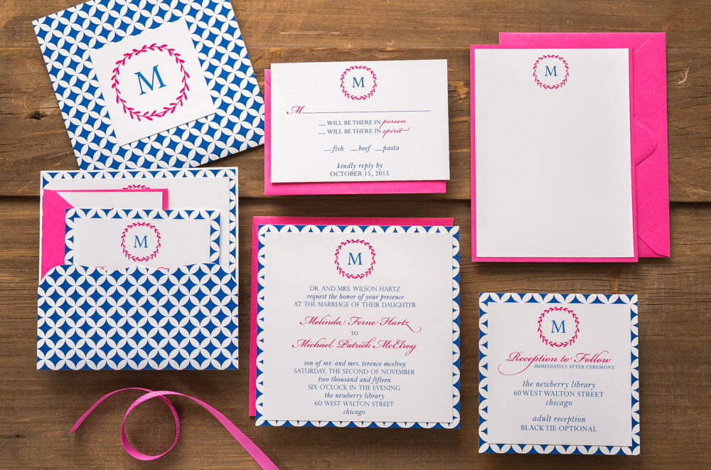
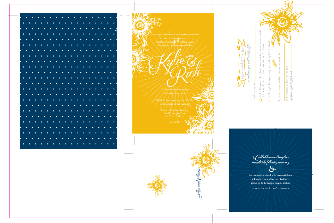
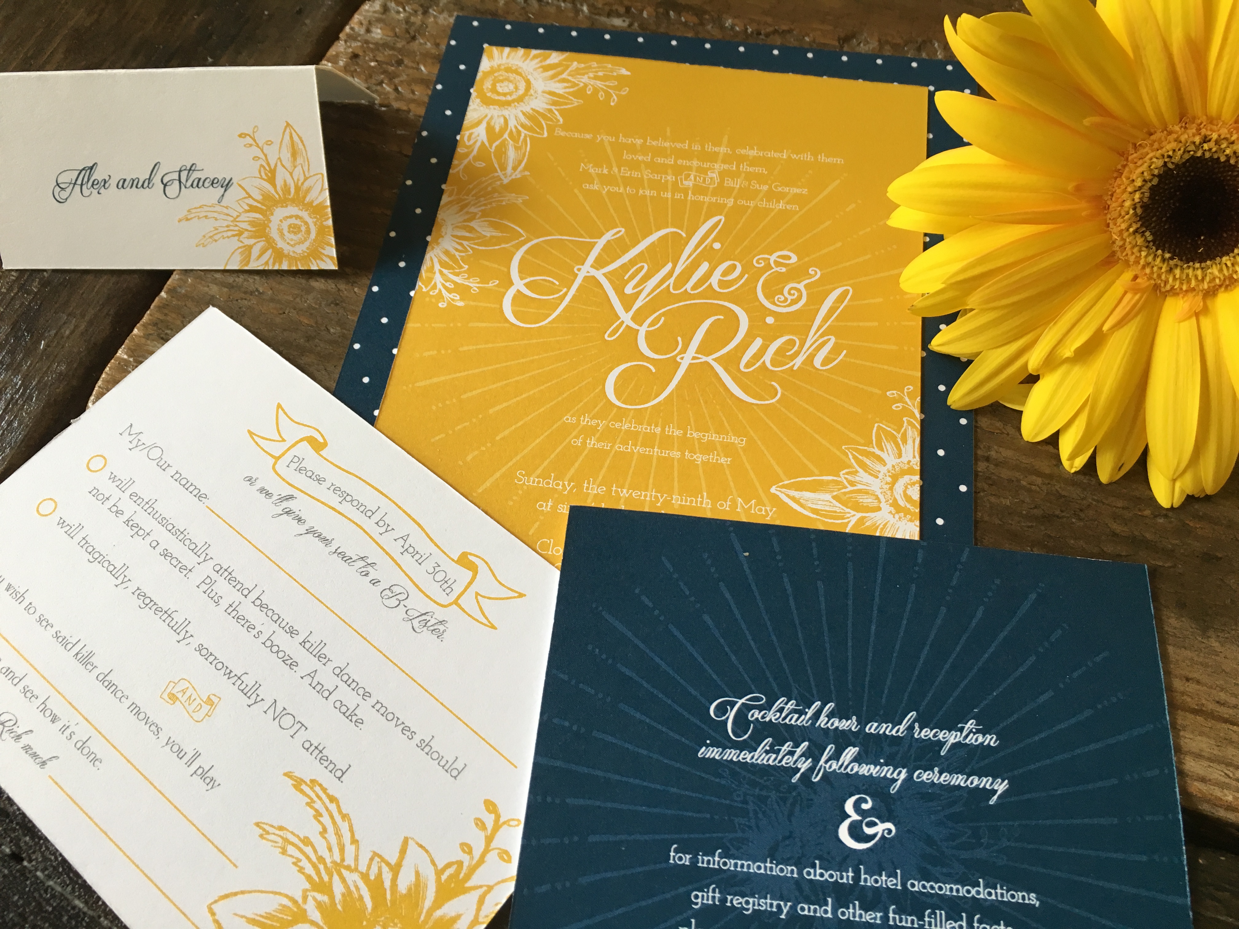
While white with greenery will still grace many weddings, this year brings rich color back. A less formal, warm vibe is applied to just some of the options you can access at StationeryHQ.com. Click photo to see more wedding options. 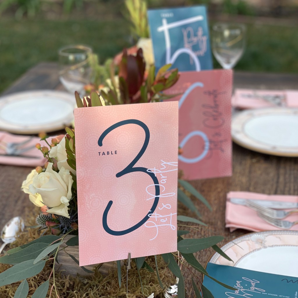
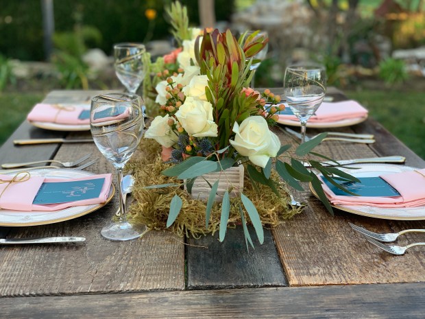
We printed table numbers on 8.5 x 5.5 cards using our variable data option. Create as many original designs as you need and put them in a multi page pdf file and upload. That’s it. 
Our water resistant beverage labels add a little panache to beer, water bottles, and wine bottles. 
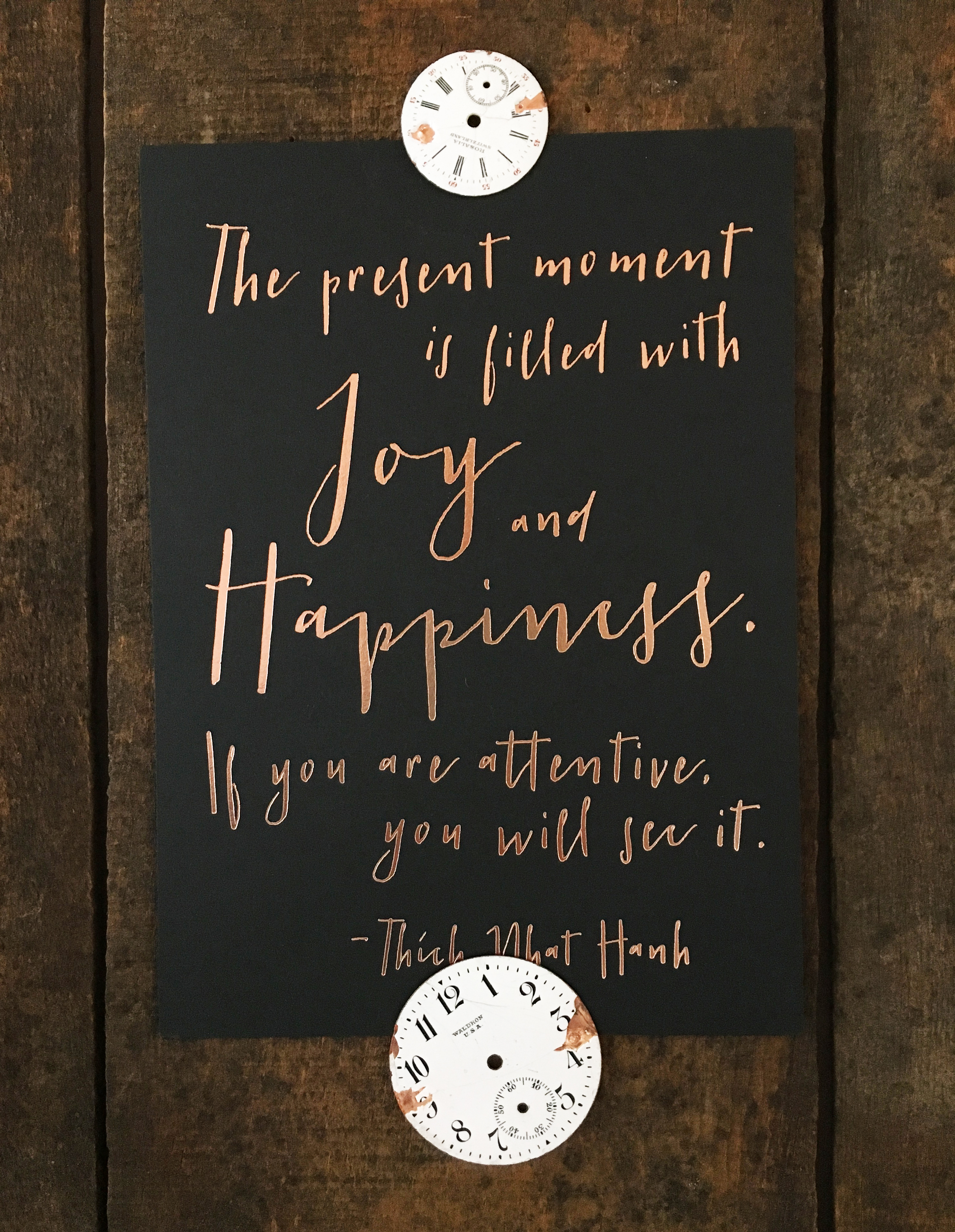
We got creative with a product that is typically used as a growth charts for littles. Fine printing on a heavy canvas with dowels at the top and bottom and a ribbon for hanging makes for a gorgeous and inexpensive sign. Click on the image to see exact dimensions. 
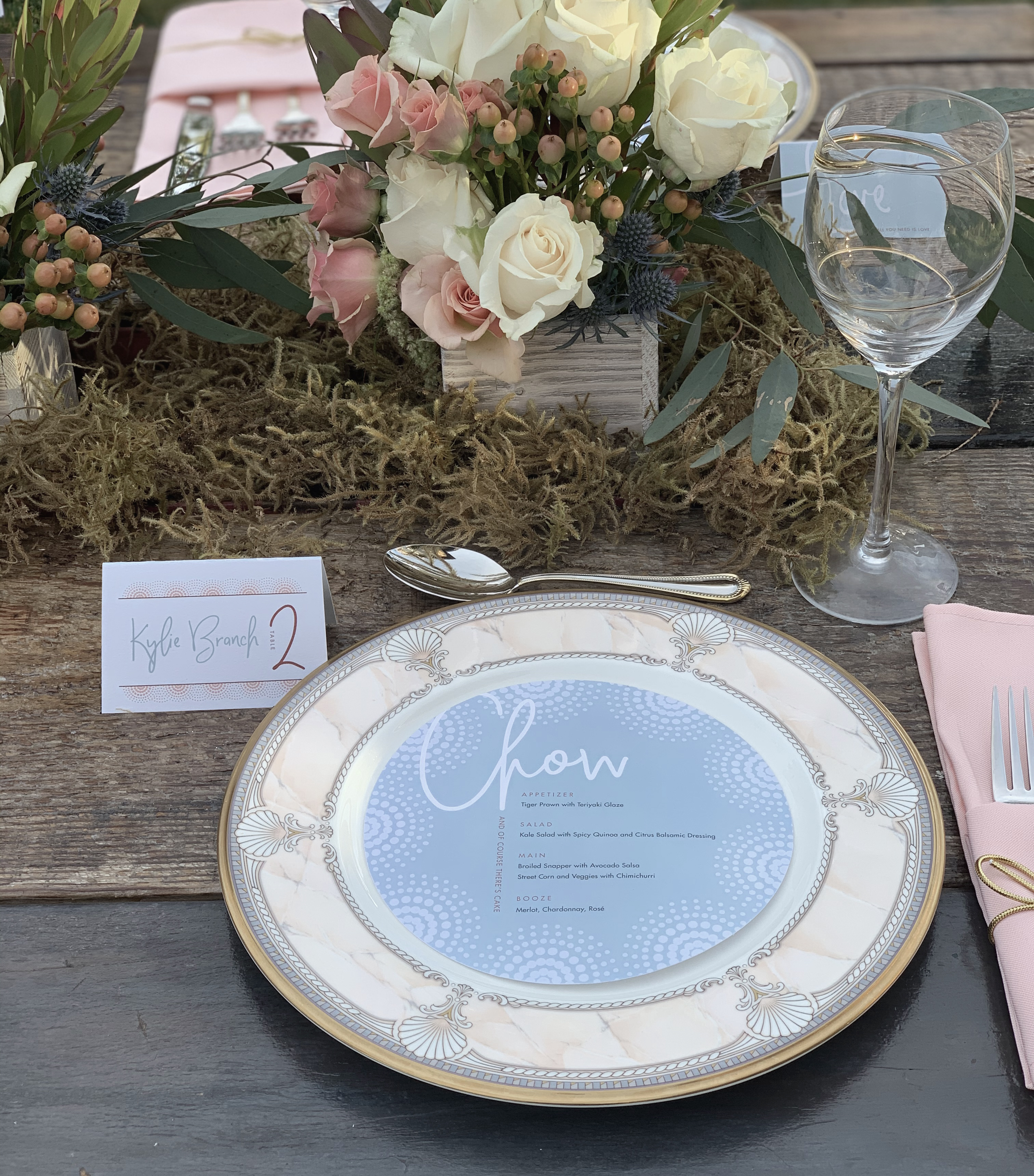
Variable data place cards are the perfect way to bring the theme to the table. Do just one design for all, or create a series of cards that corresponds to a table number design. The back is the perfect place for various quotes about love or fun facts about the couple.

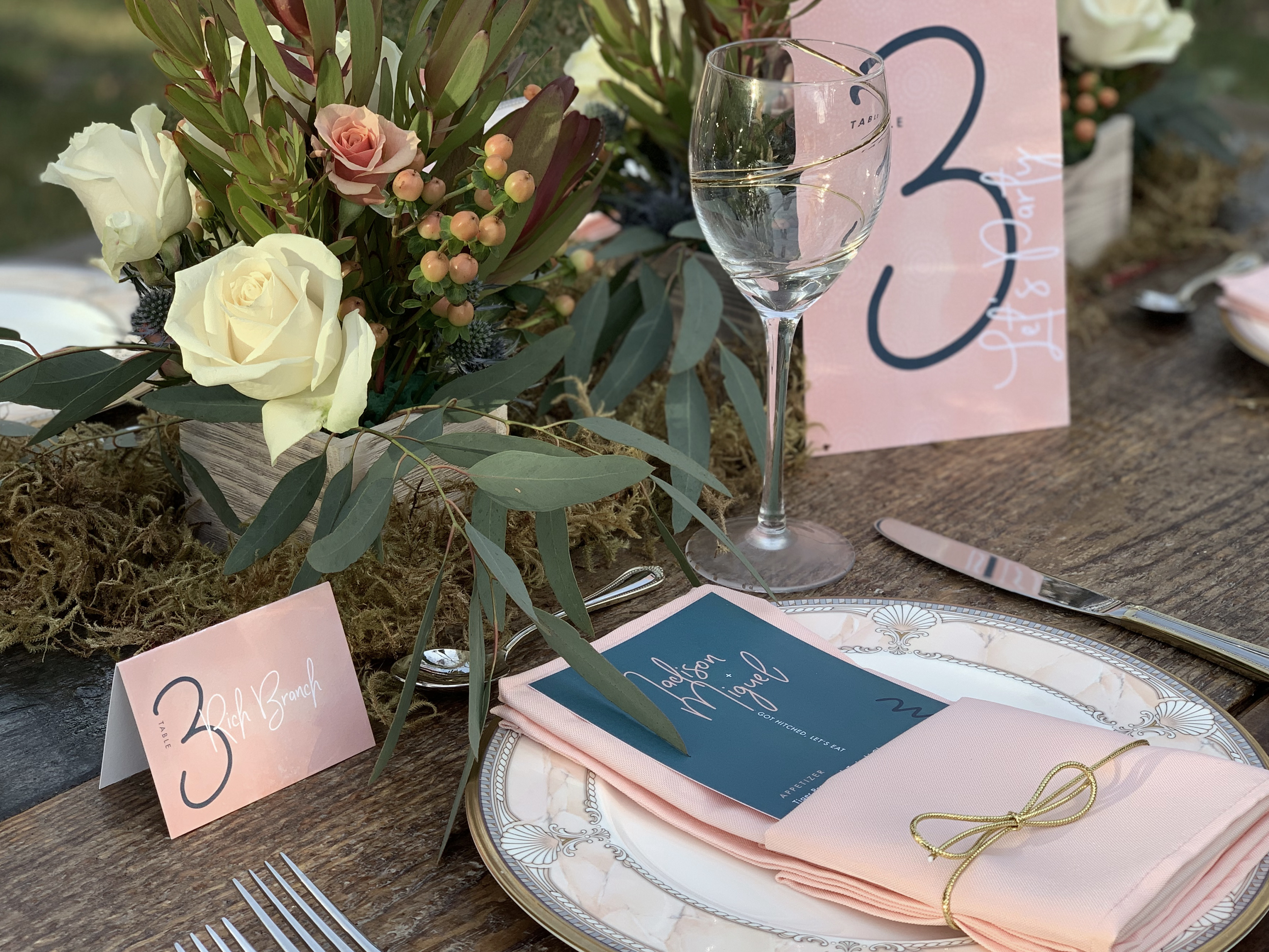
Or choose our 6″ Round Die Cut for your menu for a little whimsy.
Keep in mind that with smaller crowds at weddings, it’s easier than ever to add designer touches and personalized paper accents. Brides and grooms will love the pieces that reflect them and their relationships. Look for more whimsy, humor and intimacy in wedding design for 2021. And don’t forget about sustainable paper, that will be important to your clients. We currently carry Recycled Cotton T-Shirt (actually mad from…wait for it… recycled t-shirts), Bamboo, Hemp and 100% Smooth Post Consumer Waste in most sizes and products.
Here’s to love and celebrating in 2021 – cheers!


 Yep, we added more foil stamping color options on