stationery design

Color: WTH?

What The Hue? Designers love color. We love love love it. And it makes us want to pull our hair out when we can’t get the color we see on our monitor to match the color we see on paper. There are many variables that affect color: our monitor settings (which will never match our clients settings), the tone of the paper we print on (not all white papers are created equal) and color blindness (for real, 8% of men and .5% of women are color blind). 

Color test on different papers.

Color test on different papers.

Here are some tips to help you get the best results and make peace with what you can’t control.

Let’s start with what you see on your screen. 

– Apple monitors tend to be lighter overall than PC monitors. So if you’re on a Mac and sending digital proofs to someone on a PC, they are likely seeing a darker version. Your only tool for dealing with this is knowledge. Optimize your monitor settings and talk your client through it if they say “it looks dark.”

– RGB will ALWAYS look more intense and pure than printed CMYK. It has to do with RGB colors coming from light and CMYK colors coming from surface material. Here’s a good article for color geeks.

Here’s what we know about color in print:

– Paper can be considered a color. If you choose a natural or ivory stock, you are adding up to 10% yellow to your color mix. For the truest color, pick the brightest white stock. Our brightest whites are the #110 uncoated (it has a cool tone), Savoy (warm tone) and Felt (warm tone).

same CMYK values printed on Savoy White and Savoy Natural

Same CMYK values printed on Savoy White and Savoy Natural

– Uncoated papers will soak up more ink than coated or gloss stocks, giving them a less vibrant appearance. So if you want really bright color on uncoated paper, you gotta saturate it – give it more ink than you think you need.

– CMYK digital printing is not perfect. You won’t get the same result on different days like you might if you used Pantone colors (which are the equivalent of a can of paint). There are only about a million variables that affect digital printing.

For the best results, I have printed my own color swatches (which I update by trend or season) on multiple stocks so I have a good idea of the difference between my screen and my print jobs. I use the DIY product option on StationeryHQ.com so I can fit lots of decent sized color swatches.

My color swatches rank right up there with pictures of my kids in my studio.

My color swatches rank right up there with pictures of my kids in my studio.

If you are designing a stationery suite, try using complementary colors or adding texture into your system to break it up. Matchy-matchy is getting kind of old school and then you won’t be so stressed when your coral invite looks 1% lighter than your coral RSVP card. 

Please post your questions, suggestions or photos of great solutions on our facebook wall, we all appreciate the extra help.

Should you be using Illustrator, InDesign, or Photoshop?

We are frequently asked by designers, “Should I be using IllustratorInDesign, or Photoshop?”

Normally, we would urge them to use the tool that they are best and most familiar with. After all, you can do the similar things in all of the programs and achieve very similar results. However, there are some key differences between the three that can affect how your artwork will print.

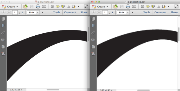
While Photoshop is an amazing tool for image and color editing, it can present printing challenges when it comes to wedding invitations, birth announcements, and other fine stationery. The reason for this is because it is a pixel based program. From a distance, you may not notice this. But if you zoom in, you will see that your letters and designs are built pixel by pixel. For the finer details, it can be very noticeable.

Illustrator and InDesign, on the other hand, work with shapes, called vectors. Vectors are based on mathematical curves (oh boy…), and because of this, it doesn’t matter how big or small they are. The shape will always remain crisp.

Screen Shot 2014-03-17 at 5.21.52 PM

Comparison of an Illustrator PDF vs a Photoshop PDF

We (and our competitors) produce through digital printing, which is not as high resolution as conventional offset printing. Most of the time, you wouldn’t be able to tell the difference; however, digital printing tends to have more trouble with small or thin text. Our digital presses print with dots instead of actual lines, and when the text gets too thin, the dots just can’t do a good job of replicating what it looks like on screen. Because of this, it is even more important to make sure your files are created in the best quality possible.

If you were to create and save a design in Illustrator, then save the same design in Photoshop, and then print them both on the same sheet, they would actually appear different. Illustrator outputs vectors and then the press changes it to dots. Photoshop creates dots (pixels) and then the press creates different dots. It is more reliable to count on the vectors to be converted into dots than pixels. Hopefully this makes sense.

Of course, for many designs this might not be a big deal, but when it comes to time crunched wedding invitations for a bridezilla, do you want to take any risks?

Long term, we really recommend adding Illustrator or InDesign to your toolbox for an optimal printing experience. We believe that this will help to make your customers happier.

Jaimie