CMYK

WTH is navy blue and why does it look purple?

What you see on screen can vary from the final printed product and this is often true when working with the color navy blue. It looks like the perfect blue on your monitor, but when you get your cards back, first you see purple and then you see red! Your monitor uses the RGB color model (red/blue/green) which differs from the CMYK (cyan/magenta/yellow/black) ink colors used in print, making navy a thorn in your side.

navy2a

The issue is caused by the amounts of cyan and magenta in the mix. Remember learning about the color wheel in school? You learned that when you mix blue with red, you get purple, right? It’s the same idea with 4 colors, too. Too much magenta mixed with cyan will leave you with purple, when you really wanted a dark blue. The color might look right on screen, but it will most likely print more purple than blue. Paper can also affect the way a color prints, but that’s a whole different story.

navy2b

A good mix for navy blue can vary a bit. 100C/85M/0Y/50K will give you a darker navy blue. You can always adjust the black (K) if it seems too dark. 100C/85M/0Y/30K will produce a lighter navy and even though it looks deceptively close to 100C/95M/0Y/0K on screen, don’t let your eyes fool you. Of course, there’s no absolute perfect mix, but these are good bets. Give one of them a shot next time you’re prepping files to upload to StationeryHQ!

CMYK – The More You Know

Around these parts, we like four colors. Not three and certainly not one. EW. Stationery HQ files should be set up with CMYK, not RGB or Pantone/PMS colors.

To make it easy, we made a visual guide to show you where to convert colors using three different Adobe programs.

InDesign:

color_ID

Illustrator:

color_AI

Photoshop:

color_PS

When in doubt about how to set up your files, please check out our File Setup Guidelines.

 Note: We’re using the Adobe Creative Cloud version of these programs, so they might look slightly different than yours. 

100% K is your friend

Your super fab design is done and you’re ready to save a file to upload to Stationery HQ. You save your files according to the SHQ File Setup Guidelines and when you go back to check your PDF, your 100% black (K- 100) text magically morphed into a black build (CMYK). WTH?

To make sure the colors you chose stay the same, save your Color Conversion settings the same way we did in the screen shot below. Under the Output tab, choose Color Conversion > Convert to Destination (Preserve Numbers). Then make sure your file is CMYK and not RGB. This will keep your colors in check without changing them. Mind blown!

save_preserve_numbers


Color: WTH?

What The Hue? Designers love color. We love love love it. And it makes us want to pull our hair out when we can’t get the color we see on our monitor to match the color we see on paper. There are many variables that affect color: our monitor settings (which will never match our clients settings), the tone of the paper we print on (not all white papers are created equal) and color blindness (for real, 8% of men and .5% of women are color blind). 

Color test on different papers.

Color test on different papers.

Here are some tips to help you get the best results and make peace with what you can’t control.

Let’s start with what you see on your screen. 

– Apple monitors tend to be lighter overall than PC monitors. So if you’re on a Mac and sending digital proofs to someone on a PC, they are likely seeing a darker version. Your only tool for dealing with this is knowledge. Optimize your monitor settings and talk your client through it if they say “it looks dark.”

– RGB will ALWAYS look more intense and pure than printed CMYK. It has to do with RGB colors coming from light and CMYK colors coming from surface material. Here’s a good article for color geeks.

Here’s what we know about color in print:

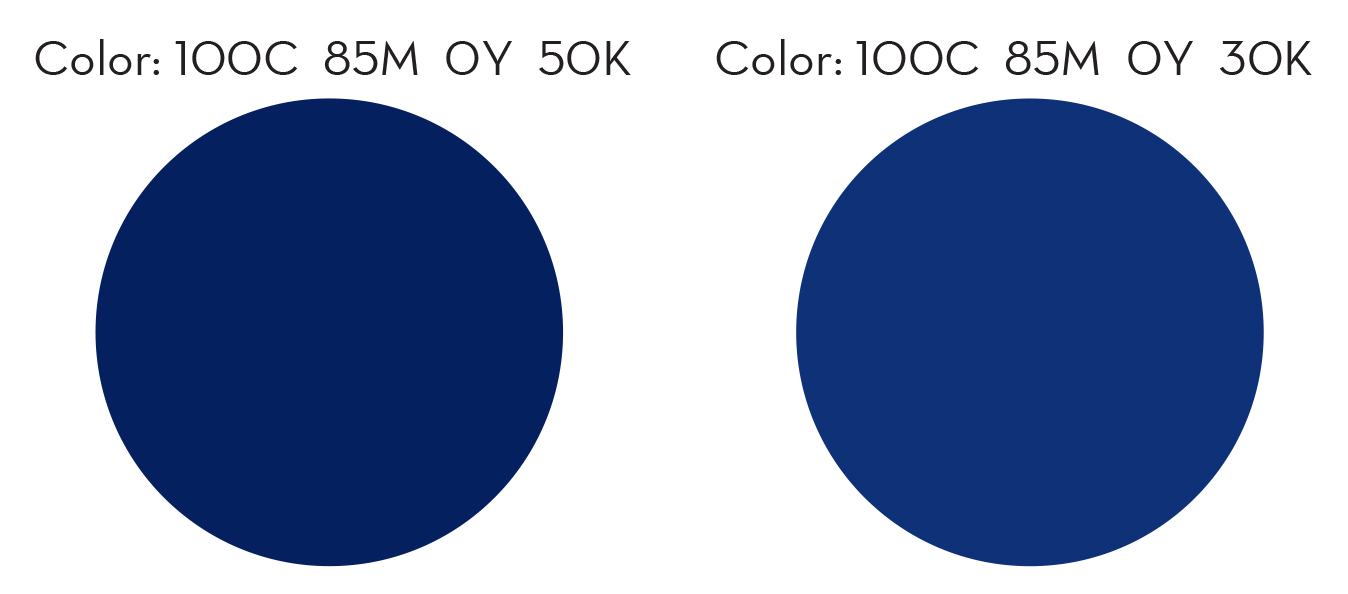
– Paper can be considered a color. If you choose a natural or ivory stock, you are adding up to 10% yellow to your color mix. For the truest color, pick the brightest white stock. Our brightest whites are the #110 uncoated (it has a cool tone), Savoy (warm tone) and Felt (warm tone).

same CMYK values printed on Savoy White and Savoy Natural

Same CMYK values printed on Savoy White and Savoy Natural

– Uncoated papers will soak up more ink than coated or gloss stocks, giving them a less vibrant appearance. So if you want really bright color on uncoated paper, you gotta saturate it – give it more ink than you think you need.

– CMYK digital printing is not perfect. You won’t get the same result on different days like you might if you used Pantone colors (which are the equivalent of a can of paint). There are only about a million variables that affect digital printing.

For the best results, I have printed my own color swatches (which I update by trend or season) on multiple stocks so I have a good idea of the difference between my screen and my print jobs. I use the DIY product option on StationeryHQ.com so I can fit lots of decent sized color swatches.

My color swatches rank right up there with pictures of my kids in my studio.

My color swatches rank right up there with pictures of my kids in my studio.

If you are designing a stationery suite, try using complementary colors or adding texture into your system to break it up. Matchy-matchy is getting kind of old school and then you won’t be so stressed when your coral invite looks 1% lighter than your coral RSVP card. 

Please post your questions, suggestions or photos of great solutions on our facebook wall, we all appreciate the extra help.

Prepare Your Files for Custom Digital Printing

We receive a lot of questions from our customers regarding how to properly prepare and upload files to StationeryHQ to take full advantage of our digital printing services. Whether you’re creating custom note cards, customized greeting cards, digital letterpress stationery, wedding invitations or other personalized printed items, we can help you create high-quality products with your perfect design touch.

You can use our easy templates and online ordering system to create your own personalized designs. Want even more creative control over your custom stationery project? Not a problem. We can work with your unique designs, including die cutting, digital letterpress and more.

Whichever production option you choose, just follow these five simple tips as you prepare your files for digital printing to ensure your personalized paper goods are printed exactly the way you want them—every time.

Upload-1024x790

1. Sizing your artwork for digital printing. Make sure your file includes a bleed area on all sides. StationeryHQ requires at least 0.05 inches of bleed (0.125 inches is preferred) on each side to allow for trimming. Even if your project design is unprinted on all four edges, your production file should still include a bleed area.

2. Setting colors for proper printing. Convert all colors to CMYK—including PMS, spot colors and RGB—and make sure your document mode is set to CMYK. Please specify flat black (C=0, M=0, Y=0, B=100) instead of rich black. Any heavily saturated color should be under a combined CMYK value of 240.

3. Including your fonts. To ensure that your custom stationery project prints perfectly on our digital presses, please embed or outline all fonts.

4. Preparing file set-up. Don’t add “printer’s marks” such as crop marks, bleed marks or color bars. These will increase the document size, and you will not be able to upload your file, or your project will print incorrectly.

5. Saving a document for digital printing. Always save your document as PDF/ X-1A. This will flatten all the file layers correctly for our presses.

Our customer service team is available to help if you have any questions about preparing your project files for digital printing. Please contact info@stationeryhq.com for assistance.

How to convert your files to CMYK – #1 in our tutorial series

Today, we’re kicking off a series of short videos that we hope will make some of your lives just a little bit easier. Many of you are new to the world of digital printing, having come to us from various other related backgrounds including letterpress and photography, and we even have some self-taught designers. So for some of you, setting up files which will print exactly the way you want has been rather challenging.

Let’s start off by tackling the most common problem you’ve brought to our attention:

“My colors looked perfect on my screen, but when I received my order from StationeryHQ, the colors were wrong.”

99% of the time, this is because the file was submitted in RGB mode and/or used PMS colors (also known as Pantone or spot colors). Your files should be uploaded in CMYK format. So, you ask:

“How do I convert my spot and RGB colors to CMYK?”

Great question! Here’s how to do exactly that in any version of Photoshop or Illustrator:

“What’s the difference between RGB, PMS and CMYK anyway?”

Letterpress uses PMS and spot colors, which are pre-mixed ink colors. Your computer screen displays RGB colors, which are a combination of red, green, and blue light. Printing presses use CMYK inks – cyan, magenta, yellow, and black (also know as 4 color process) – to create all colors, but some RGB and PMS colors just can’t be reproduced in CMYK inks (these colors are known as “out of gamut”). When you convert your files to CMYK, you will see a shift in some colors. The ones which shift are out of gamut. Once you see this on your screen, you’ll have a pretty good idea of what the file is going to look like when it prints, so you can make adjustments to those colors if necessary.

To avoid these kinds of surprises and the need to convert your files later, you can simply start your design in CMYK mode whenever you are creating a file which needs to be printed.

(This is a quick and dirty explanation – it’s worth a Google for more thorough info.)

Have any questions about this topic, or any suggestions for future topics? Please post them in the comments!