You’ve designed a fabulous card and now you want StationeryHQ to print it! You saved a PDF/X-1a, just like the SHQ File Setup Guidelines say, but your file doesn’t fit the preview area. What happened? It could be that you didn’t account for bleed in the file.
Bleed is essential in print so the image goes all the way to the edge of the card. Without bleed, you’ll get white strips around the design that aren’t meant to be there. Even if your card has a white background, it can still be cut the wrong size if a bleed is not included.
There are two ways to add bleed to your file. This example uses Adobe Illustrator, but this process is universal with Adobe software.
Method 1: Add bleed to file by calling out a “Bleed”
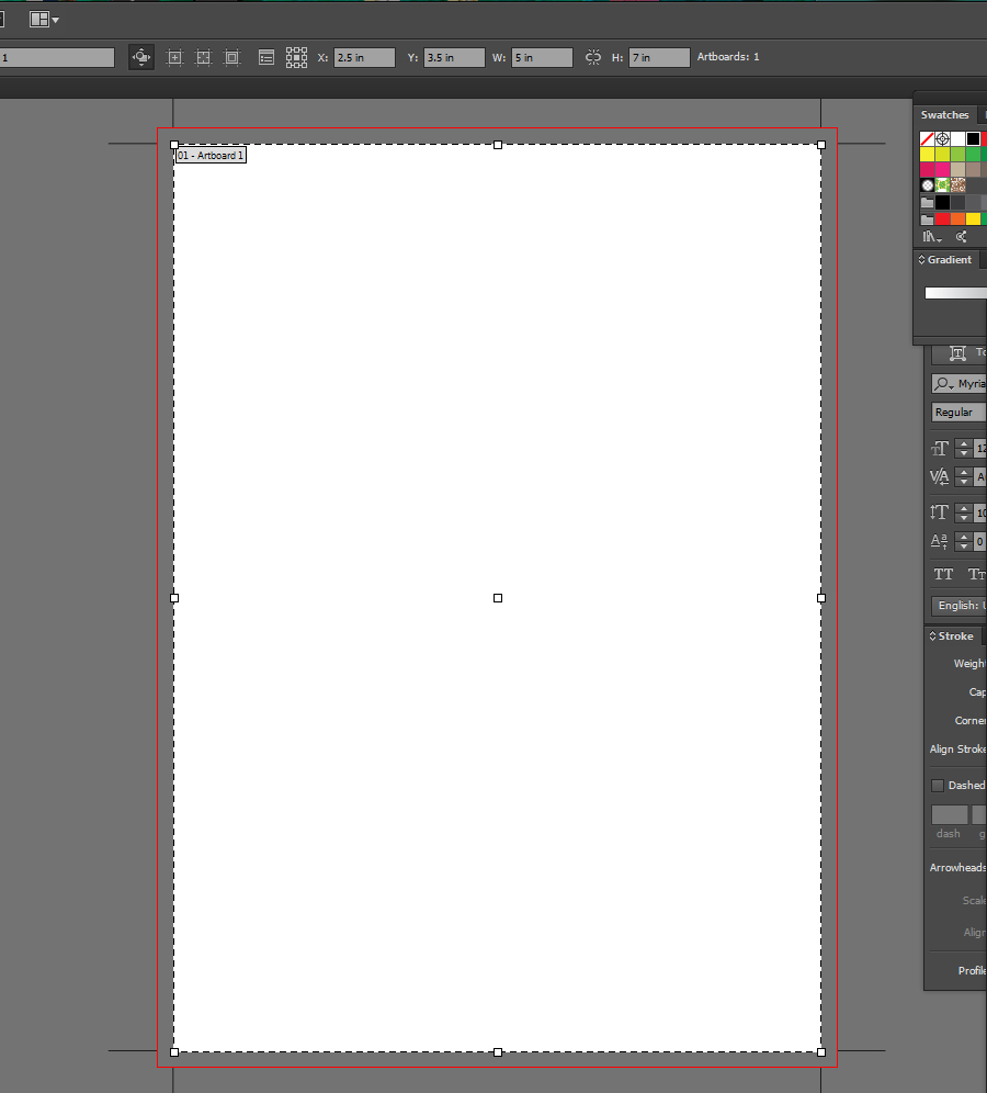
The screen shot below shows how to set up your file from scratch using this method. When creating a new document, plug in the size of the final card size (we used 5 x 7) and then call out the bleed below. SHQ requires a .25 bleed to both width and height, so you’d add .125 on all four sides for a total of .25 to both dimensions.

The screen shot below shows how the file you just created should look. The artboard is 5 x 7 and has a .125 bleed all the way around. Your design should go all the way to the red line around the 5 x 7 to cover the bleed area.

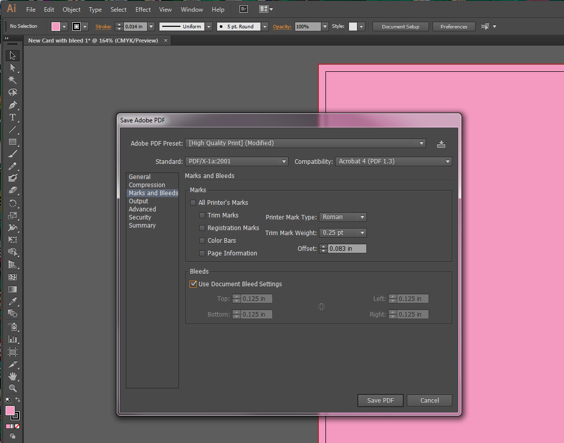
Then when you go to save your fab design, make sure to check the box “Use Document Bleed Settings” in the pop-up window.

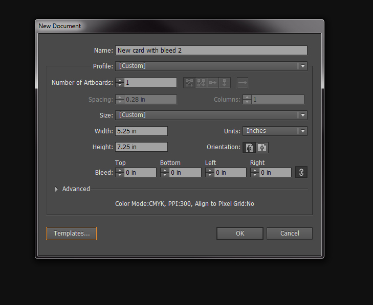
Method 2: Add bleed to file by including bleed in the size of your artboard
The screen shot below shows how to set up your file from scratch using this method. When creating a new document, plug in the size of the final card size including .25 for bleed. We made a 5 x 7 card, so the dimensions would be 5.25 x 7.25. Leave the Bleed section alone because the bleed will be added in to the size of your art board.

The screen shot below shows how the file you just created should look. The art board is 5.25 x 7.25. Your design should go all the way to the edge of the art board to cover the bleed area.

Then when you go to save your fab design, do not check the box “Use Document Bleed Settings” in the pop-up window. You’ve already added the bleed to your final size, so you’re good to go.

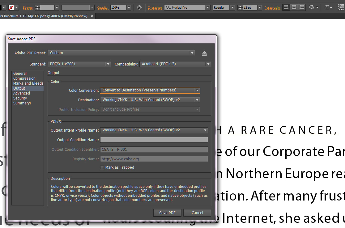
And for good measure, don’t forget to outline fonts, change all Pantone colors to CMYK and save as a PDF/X-1a.
Now when you upload your 5 x 7 card to the website, it should fit perfectly into the preview!