Author: Erin Sarpa

I'm Erin, Co-Founder of EandI Design, a creative agency. I have a passion for finding adventure and bringing a little sunshine wherever I can.

Guest Post by Sarah Schwartz: Signs Leading to Stationery Success

I’ve had the honor of covering the stationery market since the late 1990s — which means I’ve been around long enough to be able to differentiate the trajectory of an enduring designer or company — as well as those who tend to burn out and move on after a while. Quite often, triumphing in our tricky environment is simply a matter of adjusting your attitude and approach, so I’ve outlined four quick ways you can start writing your success story today.

photo 3

Nice Guys Finish First

It’s well known that ours is an industry distinguished by its warmth and supportive nature — so those who don’t share those traits quickly differentiate themselves, but not in a very positive way. As kind and open as our peeps tend to be, word does get around about those who don’t share those qualities. In my experience, they don’t tend to stick around very long.

Promote What You Preach

All of us sit at the same table and want the same thing — for the art of letter-writing, invitation-using and card-sending to endure. So the next time someone does something kind for you, step away from your email and mail an actual note. If we can’t continue this practice, how can we legitimately hope consumers will?

Keep Your Eye on the (Design) Prize.

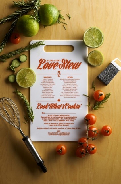
What every designer has to offer the world is completely unique to them: their own personal vision. While macro design trends tend to be simultaneously reflected in the work of many lines, the most lasting perspectives make sure their output doesn’t look like that of anything else — and even better, can be instantly recognized as completely their own.

Take Your Time

Once you have experienced the sweet taste of success, it’s tempting to expand into more gifty product categories, e.g., mugs and T-shirts. While this may be lucrative in the short term, extending into several categories quickly can undercut the value of your brand and the quality of your product. You’ve had your whole life up until now to envision that greeting card or invitation line  — make sure your next release is equally well thought out.

Reigniting the creative flame

People like us have a deep need to create. But it’s not always easy to be brilliant on demand. Some days I feel pretty unoriginal so I have to shake things up. A great playlist might do the trick and a change of scenery almost always works. I was invited to attend a 3 day workshop in Palm Desert with some seriously creative peeps last week. My first instinct was to turn it down because I have too much to do and because there are no TVs at Miracle Manor (seriously, that’s where we stayed) and the World Series was gonna be playing. But then I decided this was probably the kick in the pants I needed so I went for it.

10171656_10204057602492949_5173021618694344479_n

I used crayons during all of our sessions, felt great to color again.

64760_10204057602812957_535352911780970895_n

Sunrise hike in the desert with my new homies.

10734120_10204057604372996_8185027166529486202_n

Had fun with photography on my morning hikes.

We spent 3 days problem solving around professional challenges while we colored with crayons. I have always found a lot of value in having a creative community with whom to bounce ideas around. And I always liked crayons so that’s  a win-win for me. I came back refreshed and ready to inspire and be inspired. I know we can’t always take off to faraway places but I bet taking an hour away from your computer to go for a walk or to a local musuem would be time well spent.

GIFT TAGS – WOOHOO!

SHQ_GiftTags

You’ve been asking for these little goodies for awhile now and I’m so happy we are able to deliver! If they are as big of a hit on StationeryHQ.com as we hope, we’ll add more sizes and shapes after the holidays. Go here for pricing, don’t forget to register/login for wholesale pricing: Gift Tags

In the meantime, here is a graphic to help you set up your files.

Die_2.5GiftTag

Die_2.5GiftTagBack

Designing for Double Thick Paper


Twice as nice, double thick paper

Twice as nice, double thick paper

We LOVE the double thick paper trend (hey, Paper Homies). Assuming that you love it too, there are a few things to know about getting the most bang for your buck. Double thick printing requires a little more finesse than our standard printing process. Printing on double thick involves multiple steps including perforating, folding, gluing, and cutting which means that errors are more common.

A 1 to 1.5 millimeter shift in front to back is very common. Your design should never include typography or borders that are close to the edge, that’s just asking for alignment issues. And by “close” I’d say give yourself a 1/4 inch between things that matter and the cutting edge.

We have also discovered that Savoy Cotton doesn’t love the automated gluing process so these will be hand glued in the future. We are happy to provide hand gluing for those who have a love affair with Savoy but it will cost a bit more than our other stocks.

Other than that, go double nuts on double thick, your clients will love it.

Designing for Digital Printing

A sneak peek at what it takes to print beautiful stationery...

A sneak peek at what it takes to print beautiful stationery…

With Holidays coming quickly I thought now would be a good time to let you know about some of the key factors that will ensure your projects print beautifully. You probably know most of this already, but just in case…

1. Thin borders will rarely come out even. We batch and print large volumes so we can offer the best prices, this requires automated processes. If you can’t live without a border, make sure that it’s a minimum of 1/4″ (not including bleed).

2. Teensy weensy type in anything but black will be hard to read cuz it’s made up of cmyk dots. I’m not saying you shouldn’t use colored type, just be prepared if you do a 6pt serif in a pale aloe. (yes, as a matter of fact, I have tried that– how do you think I know about these pitfalls???)

3. Matching colors on multiple pieces is hard to pull off on an automated job, how about complimentary colors? More on this

4. Die cuts make a cool card into an awesome card but they take a couple more days of production time so plan ahead.

5. Quality files make quality stationery, here’s a guide to ultimate file set up: Digital Print Files

6. We have a Frequently Asked Questions page on our site that might have some helpful nuggets for you: SHQ FAQ

Production Time: what’s the deal?

Our customer service ninjas told me that they get a lot of questions about our turnaround and shipping time. In an effort to clarify the matter, I had to have a visual so I figured you creative types would prefer to be enlightened the same way.

SHQShip2


We guarantee 3 day turnaround unless otherwise noted (i.e., foil takes a little longer so it’s noted in the description on the site). We do NOT count the day that you upload your artwork and send in your order since they come at all hours of the day. Sometimes it happens even faster, we just want to make sure that you have a guideline to work with.

7 Creative Wedding Invitation Ideas

Post kindly provided by the friendly team at La La Designs

There is nothing more exciting than receiving a wedding invitation from a family member or friend in the mail…

A wedding is a mammoth event in people’s lives and being asked to share in the big day is very touching. A wedding invitation can say much more than just the date, time and venue. It is a document that confirms the love two people share and show a glimpse into their lives.

Today we are going to look at some wedding invitation designs. They are being highlighted for their uniqueness and creativity. Many of these have been created by designers for a specific couple. The designers have taken into account the lifestyle and personality of those who are soon to be wed.

The results, as you will soon see, are quirky, endearing and humorous.

Join us in the woods

This pop up design by Charlotte Fosdike will become a valuable keepsake long after its use as a wedding invitation has passed. This was commissioned by a couple who wanted to embody who they were into the invitation. They both were adventurous, outdoor people and this really comes across with the trees standing majestically over the written content.

Charlotte Fosdike

[Source: Charlotte Fosdike]

Chocolate box

This was designed by Bilda Grafiks for Marta and Richard’s wedding – a fact you will learn once you consume the delicious chocolate inside the invitation chocolate box.

Bildi Grafiks

[Source: Bildi Grafiks]

This is a novel idea and helps forge a bond with the forthcoming wedding by attaching it to something we all enjoy – chocolate.

Keep calm and marry on

Who doesn’t like a little pop culture reference? The Keep Calm and Carry On meme has exploded over the internet. Most people would be familiar with it, which is why this invite by Bruno Vergauwen would have caused a chuckle. The tea jokes, despite being rather cute, make it especially British.

Bruno Vergauwen

[Source: Bruno Verguawen]

Interactive 8-bit wedding invitation

This would appeal to people of a certain vintage – who grew up playing 8 bit games. This is particularly charming, because it unashamedly promotes the nerdy side to this couple, which is something they obvious bond over. Extra marks for the interactive element.

Off Beat Pride

[Source: Off Beat Pride]

Viewmaster

A viewmaster is a toy that allows you to look through a series of images. Many of us had them as kids. This kooky invitation design allows guests to enjoy a series of images relating to the forthcoming wedding. I think it creates a sense of play we all had as a kid and establishes that the wedding will be unconventional and fun.

Brit Co

[Source: Brit+Co]

Recipe Board

Who needs a paper wedding invitation? This couple gave their invites out on a small chopping board with a recipe on it. This design is a great example of lateral thinking, because not only does it inform guests about the big day, remains useful as kitchen utensil.

Joan Lim

[Source: Joan Lim ]

Folded Map

This wedding invitation was designed for a jet-setter couple who see themselves as citizens of the world. Their love of travel (which they share together) is reflected in these fun origami maps that fold out.

Andrea Papi Studios

[Source: Andrea Papi Studios]

Coordinating with colored envelopes

EnvelopeColorsEnvelopeColors.pdf

Some of you have asked for color breakdowns to match our envelopes. There will never be a perfect match for something that is already printed on a stock that we don’t print digitally, but I got as close as I could. Keep in mind that the paper you choose will have a warm tone or cool tone and that will impact the end the result. It’s also good to remember that non-designers don’t lie awake at night stressing about things like bad kerning and colors that are 1% off…

Color: WTH?

What The Hue? Designers love color. We love love love it. And it makes us want to pull our hair out when we can’t get the color we see on our monitor to match the color we see on paper. There are many variables that affect color: our monitor settings (which will never match our clients settings), the tone of the paper we print on (not all white papers are created equal) and color blindness (for real, 8% of men and .5% of women are color blind). 

Color test on different papers.

Color test on different papers.

Here are some tips to help you get the best results and make peace with what you can’t control.

Let’s start with what you see on your screen. 

– Apple monitors tend to be lighter overall than PC monitors. So if you’re on a Mac and sending digital proofs to someone on a PC, they are likely seeing a darker version. Your only tool for dealing with this is knowledge. Optimize your monitor settings and talk your client through it if they say “it looks dark.”

– RGB will ALWAYS look more intense and pure than printed CMYK. It has to do with RGB colors coming from light and CMYK colors coming from surface material. Here’s a good article for color geeks.

Here’s what we know about color in print:

– Paper can be considered a color. If you choose a natural or ivory stock, you are adding up to 10% yellow to your color mix. For the truest color, pick the brightest white stock. Our brightest whites are the #110 uncoated (it has a cool tone), Savoy (warm tone) and Felt (warm tone).

same CMYK values printed on Savoy White and Savoy Natural

Same CMYK values printed on Savoy White and Savoy Natural

– Uncoated papers will soak up more ink than coated or gloss stocks, giving them a less vibrant appearance. So if you want really bright color on uncoated paper, you gotta saturate it – give it more ink than you think you need.

– CMYK digital printing is not perfect. You won’t get the same result on different days like you might if you used Pantone colors (which are the equivalent of a can of paint). There are only about a million variables that affect digital printing.

For the best results, I have printed my own color swatches (which I update by trend or season) on multiple stocks so I have a good idea of the difference between my screen and my print jobs. I use the DIY product option on StationeryHQ.com so I can fit lots of decent sized color swatches.

My color swatches rank right up there with pictures of my kids in my studio.

My color swatches rank right up there with pictures of my kids in my studio.

If you are designing a stationery suite, try using complementary colors or adding texture into your system to break it up. Matchy-matchy is getting kind of old school and then you won’t be so stressed when your coral invite looks 1% lighter than your coral RSVP card. 

Please post your questions, suggestions or photos of great solutions on our facebook wall, we all appreciate the extra help.

Paper Notes: Options on SHQ.com

paperWe were recently asked for a description of our papers, so if you don’t have time to wait to get a paper sample booklet from the site, here is a little info that might help you out. 

110# Uncoated: A heavy duty bright white with a very smooth finish, this guy prints beautifully and is our house stock.

19pt Savoy Cotton: This beauty is fast becoming the fav for stationery. It has a very subtle texture, enough to make it interesting but not enough to mess with print quality. The white is bright and warm, the natural is a soft ivory color.

110# Synergy Felt: The texture of this paper differentiates it from the rest. The white is bright and prints beautifully. The Ecru is warmer/bolder than Savoy Natural.

110# Ice Pearl: The Princess of all of our papers is almost ivory with a gorgeous pearlescent finish. Photos and flat colors print superbly and the colors pick up a metallic tone from the paper. I ❤ Ice Pearl for invites and holiday cards. 

130# Mohawk Options: For those of you who prefer to use recycled paper whenever possible, this one is a winner. It’s a bright white, heavy stock and prints just as well as the rest of our arsenal. 

110# Gloss: Super smooth, bright white and if you like shiny stuff, you’ll like this paper 🙂

Many of our papers are available in double thick too, go to http://www.stationeryhq.com/a7-double-thick-card and see the drop down on the right side of the page to see which stocks you can double up for a completely awesome card.