Hello, I’m Melinda Hartz McElroy, founder and creative director of billet-doux. I’ve been dreaming up couture stationery, invitations and wedding suites since 2005. I love telling personal stories through something tangible, tactile and visually stimulating. But, as I was realizing visions for couture clients, I started to wonder, “How do you stay relevant in the broader marketplace?”
So, I decided to do something completely radical – launch my first ready-to-order wedding collection. What a novel idea! Having previously only collaborated with clients on a custom project basis, I threw caution to the wind and designed suites for imaginary brides and grooms. I immersed myself in fresh and current wedding trends and created a comprehensive collection across a variety of style categories.
It’s easy to get caught up in each and every delightful trend happening in our industry right now, but I kept focused with my targeted list of on-trend must-haves. Mixed typography, handwritten fonts, hombre color effect, monograms, polka dots, lace, floral patterns, and rustic and rhinestone details are among them. But, what are my top obsessions these days? [queue music]

1) All Things Whimsy
Whimsical elements will forever be at the tippy top of my list. At the core of who I am as a person and a designer, I love the element of surprise and the unexpected. The Brooklyn suite is a sharp detour from my typical design aesthetic; yet, it’s ironically my favorite of the collection. Brooklyn is modern yet whimsical, and perfect for the bride throwing an untraditional, offbeat wedding. [I heart that girl!]
Brooklyn Wedding Suite – billet-doux Spring 2015 Bridal Collection
Printed by StationeryHQ
2) Glam/Art Deco/Metallic
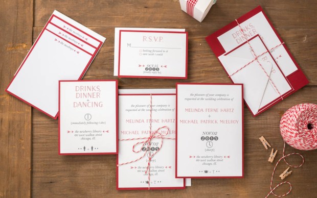
So, I squeezed three trends in one, but let’s face it – they all go together like peanut butter and jelly. Dare to kick up the glam by adding to something that’s already glamorous in its own right (that’s you, gorgeous bracket die-cut pocket enclosure!)? Selecting a rich metallic color palette and pairing it with mixed typography (another design mainstay) in simple colors creates an added layer of formality. But it’s the gorgeous glam rhinestone embellishment that transports guests of this Gatsby suite back to the Art Deco era.

Gatsby Wedding Suite – billet-doux Spring 2015 Bridal Collection Printed by StationeryHQ

3) Dreamy Paper
I find leveraging beautiful paper to be an uber refreshing design tactic. I mean, why reinvent the wheel with every card? Let thoughtful typography or custom monograms punctuate a suite, and rely on fine papers and gorgeous prints to take the lead in setting the tone. Together or on its own, printing on dreamy double thick paper can easily add a lot of impact and take your design to a whole other level. (Thank you, StationeryHQ!)
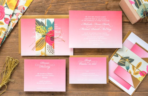
Juliet Wedding Suite – billet-doux Spring 2015 Bridal Collection Printed by StationeryHQ on double thick card stock; Rifle Paper Co. floral bellyband
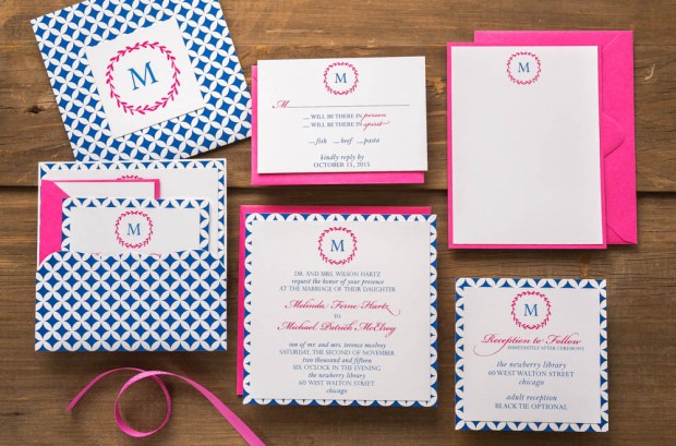
Petal Wedding Suite – billet-doux Spring 2015 Bridal Collection Printed by StationeryHQ
Enjoy my portfolio and billet-doux’s complete 2015 Spring collection at www.couturestationery.com. Keep in touch on Facebook at www.facebook.com/billetdouxinvitations or at melinda@couturestationery.com.
 About Melinda McElroy
Melinda Hartz McElroy is founder and creative director of billet-doux. From fêtes to gratitude, billet-doux has been spicing up mailboxes with one-of-a-kind cards since 2005. Melinda is the former National Marketing Director of a multinational billion-dollar accounting and consulting firm. Melinda oversaw marketing and advertising campaigns for 42 offices across the United States.
By pairing clients’ individual style with billet-doux’s unique brand of creativity, Melinda dreams up pieces that even make wallflowers bloom. Whether creating something couture from scratch or selecting from readymade collections, all items are fully customizable without limitations. billet-doux’s service offerings include wedding suites, social and business stationery, party and corporate event invitations, event details, baby announcements and holiday cards.
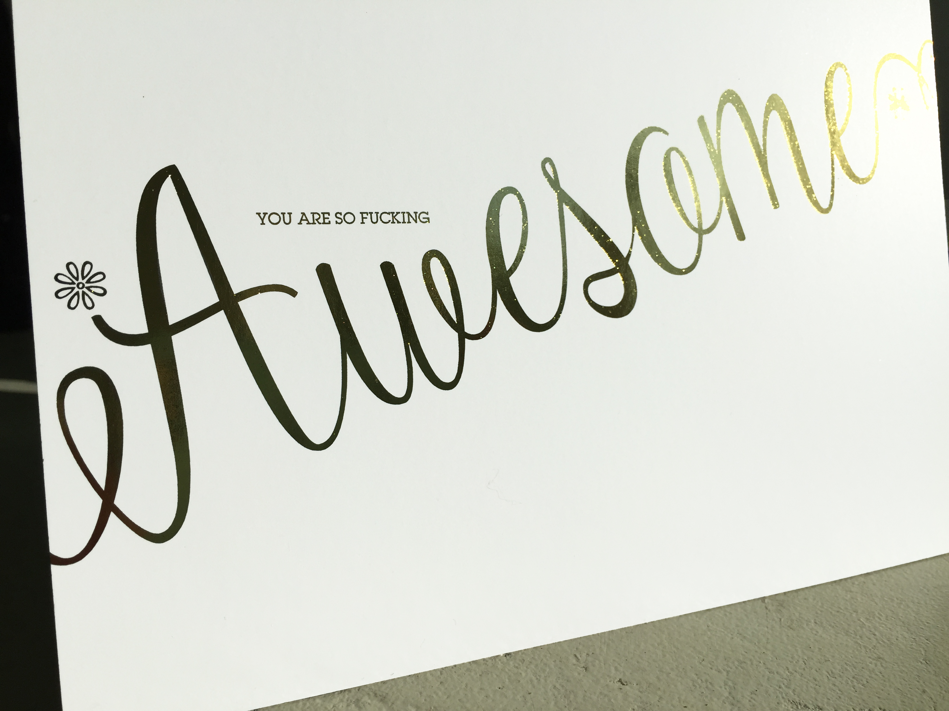
 Since launching Flat Foil Art Prints last week, we keep hearing the same question, “How does it work?”